Adidas
Interactive Experience
Adidas Retail Command Center
I designed the interface for Adidas Germany's retail operations center at their Herzogenaurach headquarters. The work included UX, visual design, 3D store visualizations, transition animations, and the information architecture that determined how raw sales data would translate into the visual hierarchy.
Regional managers use the center to monitor store performance across the country. They needed a touch screen interface for their wall-mounted display that would show live sales and inventory data from all German Adidas stores.

The interface needed to support their existing workflow:
- Identifying underperforming stores
- Diagnosing the cause
- Making merchandise or staffing adjustments
The visual system uses a traffic light convention where green indicates performance on target, yellow signals deviation, and red requires immediate attention.
01. State View
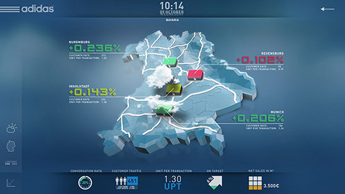
The Germany map serves as the default view, running continuously on the display.
Selecting a state opens the regional view. Each store displays its conversion rate and units per transaction. The colored indicators correspond to overall store health based on combined metrics.
The bottom bar provides access to additional KPIs:
conversion rate, customer traffic, units per transaction, target achievement, and sales per square meter.
02. Store Floor Plan
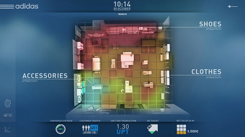
Selecting a store opens its floor plan in top-down view. The heat map overlay shows where customers spend the most time, derived from in-store tracking systems. Red and yellow zones indicate high dwell time; green and blue indicate pass-through areas.
This data informs merchandise placement decisions. Products positioned in high-dwell zones have greater visibility but may not convert if customers are browsing rather than buying. Products in low-traffic zones may benefit from repositioning.
The floor plan is divided into selectable zones: Shoes, Accessories, and Clothes. Each zone can be opened for category-level performance data.
03. Shelf View
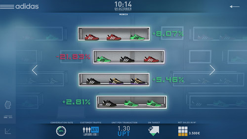
Selecting the Shoes zone displays the shelf with product-level performance.
Each row represents a shelf position with its corresponding products. The percentage indicates sales change compared to the previous period. Green percentages indicate growth; red indicates decline.
This view allows managers to identify which shelf positions and product combinations are underperforming. The interface supports horizontal navigation to view additional shelves.
04. Product Detail
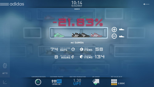
Selecting a declining product opens its detail view.
This screen shows the mi SAMBA with key inventory and sales metrics: days in store, units sold, delivery lead time, and current stock.
The large percentage at top reinforces the performance status that triggered the investigation. From this view, managers can adjust orders or flag the product for repositioning.
05. Size and Variant Breakdown
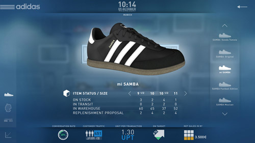
Selecting the product image opens size-level inventory data.
The table shows stock on hand, units in transit, warehouse availability, and system-generated replenishment proposals for each size.
This level of detail supports size curve adjustments. If certain sizes consistently sell out while others accumulate, future orders can be rebalanced to match actual demand.
06. Outcome
The previous workflow required managers to export sales data into spreadsheets, compare figures across stores manually, and cross-reference inventory systems to identify problems. That process could take hours and still miss patterns buried in rows of numbers.
The interface consolidated those data sources into a single visual system. The color-coded indicators surface problems immediately. The hierarchical navigation allows managers to move from national overview to individual product size in four touches.
Decisions that previously required data compilation now happen during a single conversation in front of the screen.