CellarioOS: Product Design
From Prototype to Platform
Overview
- Concept prototype created in 8 calendar days
- No existing design system, component library, or visual language for software
- Contract secured in the seven figure range
- Design direction became the foundation for CellarioOS and subsequent HighRes software platforms
My Role
- Sole designer for concept prototype
- Defined the visual direction for HighRes Biosolutions' software products
- Created interaction patterns for order management and scheduling
- Delivered clickable Figma prototype for customer presentation
00. Table of Contents
01. Context
HighRes Biosolutions expanding from hardware into software.
02. Constraints
First designer, first software hire, no existing design system.
03. The Request
Eight days to deliver a functioning prototype for a customer presentation.
04. Approach
Hardware audit and domain interviews to inform design decisions.
05. Solution
Visual language derived from industrial design, translated to screen.
06. Outcome
Prototype secured a seven-figure contract.
07. Continued Development
Design language became the foundation for all HighRes software.
01. Context
HighRes Biosolutions manufactures robotic systems, liquid handlers, and integrated lab automation platforms.
The company was expanding into software with plans to build a SaaS platform for controlling and managing their lab automation systems. I was brought on to design the UI and UX for this platform.
02. Constraints
I was the company's first in-house designer and the very first hire for the software division. The onboarding plan had allocated my first two months to learning how lab automation works, along with the fundamentals of biology, chemistry, and biotech, given the complexity of the subject matter.
There was no pressure to deliver anything during this period since my only exposure to these subjects had been in school. When people at HighRes mentioned ELISA, I thought they were talking about a person and asked who she was.
Today I know that ELISA stands for Enzyme-Linked Immunosorbent Assay and is one of the most fundamental and commonly used assays in biology and clinical diagnostics.
03. The Request
About a week in, I was asked if I could design the first version of the software and create a functioning prototype to show one of the existing customers. The presentation was scheduled for the following Wednesday at 9:00 AM. This gave me 8 days from when I received the request.
When I began working on the design, I looked at the company's corporate and brand identity.
The only thing I found was a brand guide from 2016 that appeared outdated.
I would need to start from scratch.
04. Approach
04.01. Hardware Audit
HighRes had already invested significantly in the industrial design of their hardware.
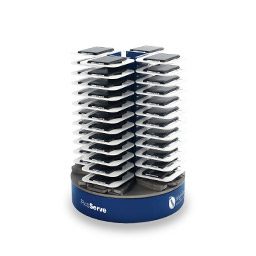
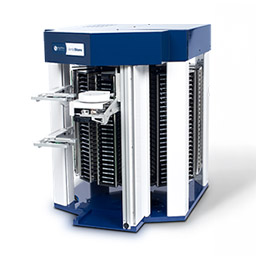
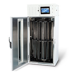
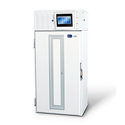
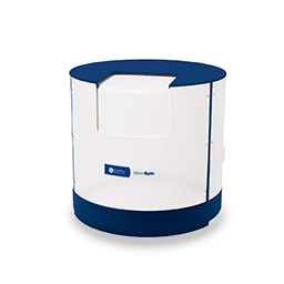
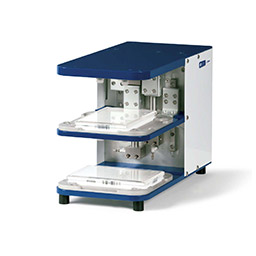
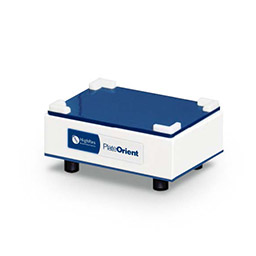
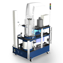
HighRes systems and devices share a unified design language across modular components that can be configured and integrated into lab environments. The best approach was to build upon what already existed and extend this design language to the software platform.
I spent a full day at the office studying the devices and systems in person, examining how they operate and documenting the industrial design language.
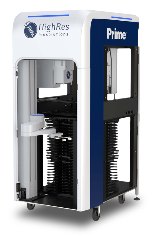
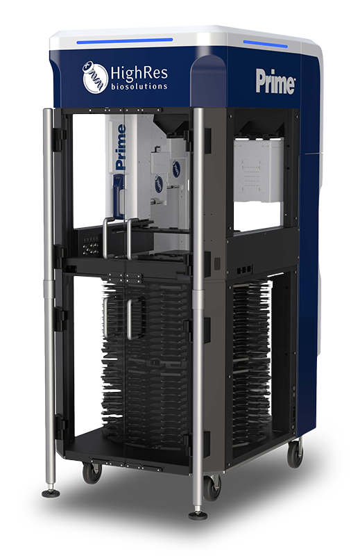
One of the flagship products, the Prime liquid handler, became my primary reference.
My reasoning was that existing customers are already familiar with the hardware, so the software should feel like it comes from the same family.
When someone looks at both, they should recognize them as one product ecosystem rather than two unrelated experiences.
04.02. Domain Interviews
Parallel to the hardware audit, I had conversations with the engineers and lab automation specialists in the company to understand how lab work is currently done manually, what errors typically occur, and which tasks are repetitive. This gave me enough foundational knowledge to design something credible even within the time constraint.
05. Solution
05.01. Visual Language

05.01.01. Hardware as Foundation
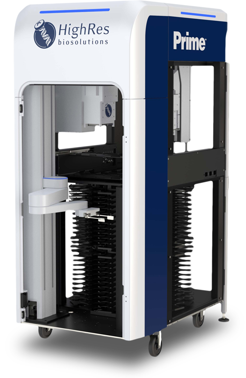
The Prime hardware reflects a sleek, functional, and purposeful design language. Its modern industrial aesthetic emphasizes clean lines, robust construction, and intentional use of branding elements. The structure is compact and modular. Rounded corners at the top soften the profile, making the equipment feel approachable rather than purely industrial. Transparent panels reveal internal mechanisms, showcasing technical sophistication. Deep blue and white reinforce the corporate identity, with metallic and black accents adding contrast.
By reflecting these elements in the software, I strengthened the relationship between physical and digital products. Users moving between the hardware and software would perceive them as part of the same system rather than separate experiences.
05.01.02. Redefining the Corporate Blue
The 2016 brand guide included a corporate blue that worked well on the physical hardware but appeared too dark on screen. I anticipated that building a full UI palette would require additional colors beyond blue, and starting with such a dark base would make the overall system feel too heavy.
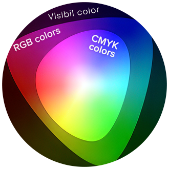
The blue also needed to translate reliably between digital platforms and print materials.
RGB's additive model produces a wider gamut than CMYK's subtractive model, and blues are particularly prone to falling outside the reproducible range. I selected a shade that sits within the gamut overlap of both systems.
The final corporate blue (#0B3158) remains within the same hue family as the original hardware blue while achieving the right balance of depth and vibrancy within a range that converts reliably. Proof printing confirmed the color performed as intended in printed materials.
05.01.03. Building the Palette
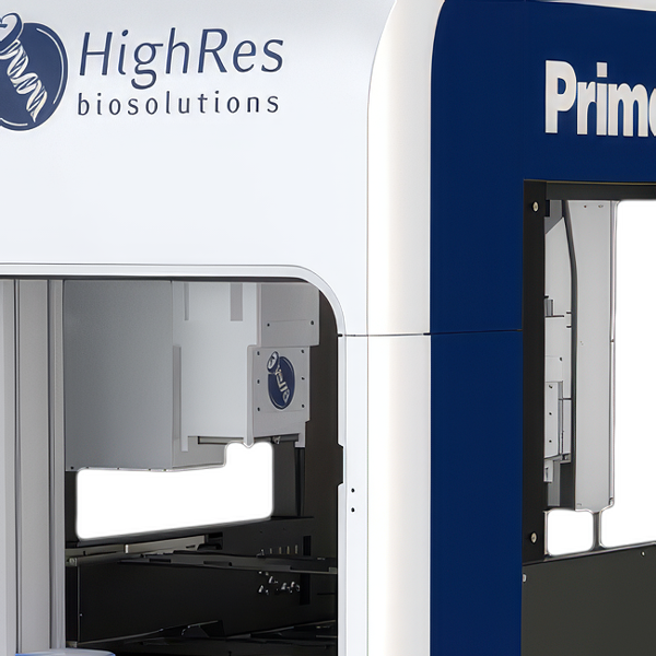
Looking at the Prime hardware, the white surfaces next to the deep blue panels do not appear as pure neutral white. Shadows on the white areas take on a slight blue tint from a combination of reflected light and simultaneous contrast. This is called a perceptual phenomenon where adjacent colors influence how we perceive each other.
The lighter values in the palette reflect this:
They are not neutral grays but carry the blue undertone that appears in the physical product.
To extend the corporate blue into a versatile system, I developed the Primary Blue Palette ranging from Primary Blue 100 (#0B3158) to Primary Blue 10 (#E6EBEF), with Primary Blue 5 (#F2F4F6) added for backgrounds.
A common approach to building color palettes is to apply fixed percentage reductions in saturation or lightness at each step.
This method is fast but produces uneven results because human perception of color is nonlinear. A 10% reduction in lightness does not appear as the same amount of change across different parts of the spectrum.
Instead, I manually refined each step to achieve perceptual balance.
The result is a palette where the transitions between shades feel visually consistent, darker values work for text and accents, lighter values work for backgrounds and highlights, and the entire range performs reliably across digital and print media.
Using the same methodology, I developed a Secondary Blue palette
and a Black palette.
The Black palette is particularly noteworthy: Black 100 is not pure black but a carefully adjusted deep gray. Pure black can feel harsh and overwhelming in interface design. The deep gray maintains richness while being softer and more versatile for text, accents, and backgrounds.
05.02. Translating to Screen
05.02.01. Color System
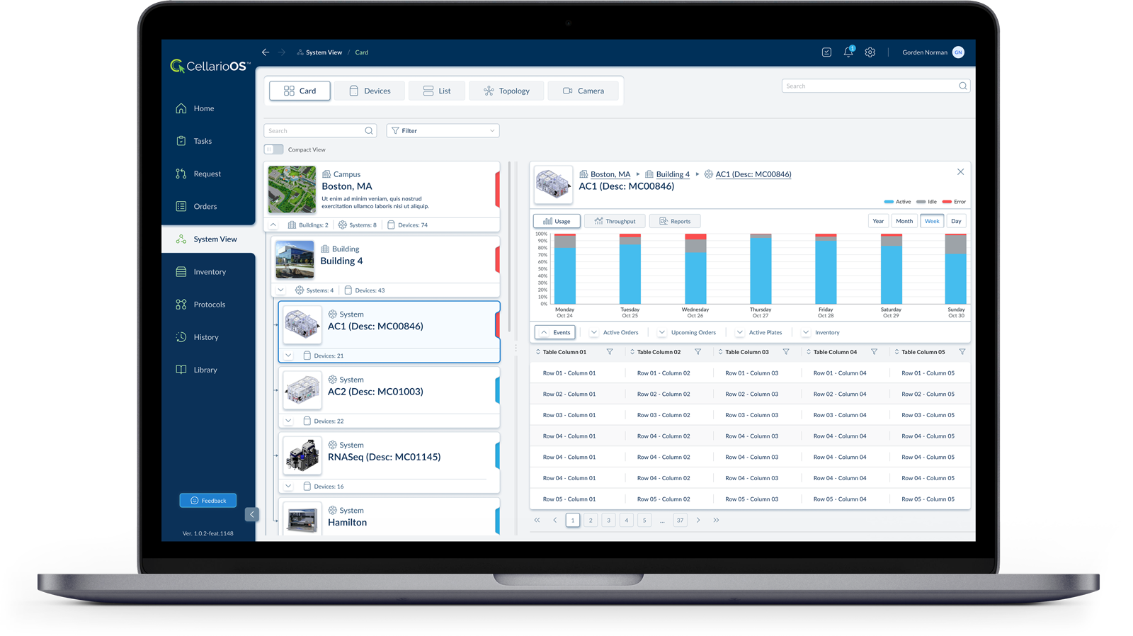
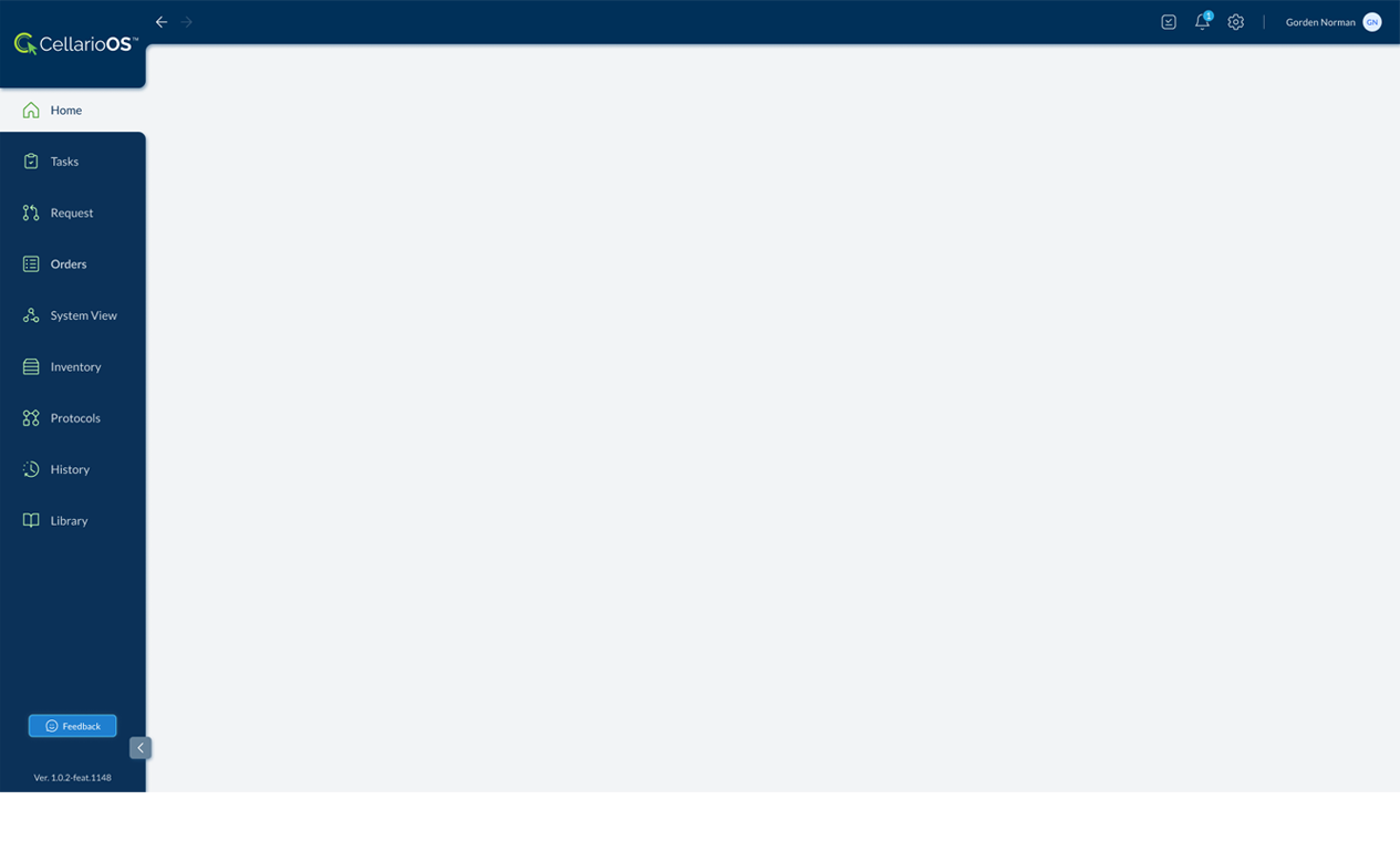
The deep navy blue of the Prime's exterior housing becomes the primary color of the navigation panel. The white body panels translate to the light gray content area. This maintains brand recognition across physical and digital touchpoints.
05.02.02. Form Language
The rounded corners on the Prime's top enclosure carry into the UI through rounded input fields, buttons, and container elements. The software avoids sharp corners, mirroring the hardware's softened industrial aesthetic.
05.02.03. Structural Hierarchy
The Prime's modular organization, where functional components occupy defined zones, translates to the sidebar navigation model. Each navigation item represents a distinct functional module: Tasks, Orders, Inventory, Protocols. The physical modularity becomes informational modularity.
05.02.04. Contrast and Legibility
The hardware uses white type on navy panels for product labeling. The UI replicates this: white text and icons on the dark sidebar, dark text on light content areas. The contrast ratio serves the same function in both contexts: immediate readability in operational environments.
05.02.05. Accent Color
The green in the CellarioOS logo and feedback button provides the same function as status indicators on the hardware: drawing attention to actionable or active elements within a predominantly blue and white environment.
05.02.06. Visual Weight Distribution
The Prime's heavy visual mass sits at the top with the branded enclosure, grounding to lighter elements below. The UI inverts this appropriately for screen context: the weighted navigation anchors the left edge while the content area remains open.
05.03. Order Management
The list view provides an overview of all orders in the system.
Each row displays key information: job ID, when the order was received, job type, runtime, time remaining, percent complete, who created it, and current status.
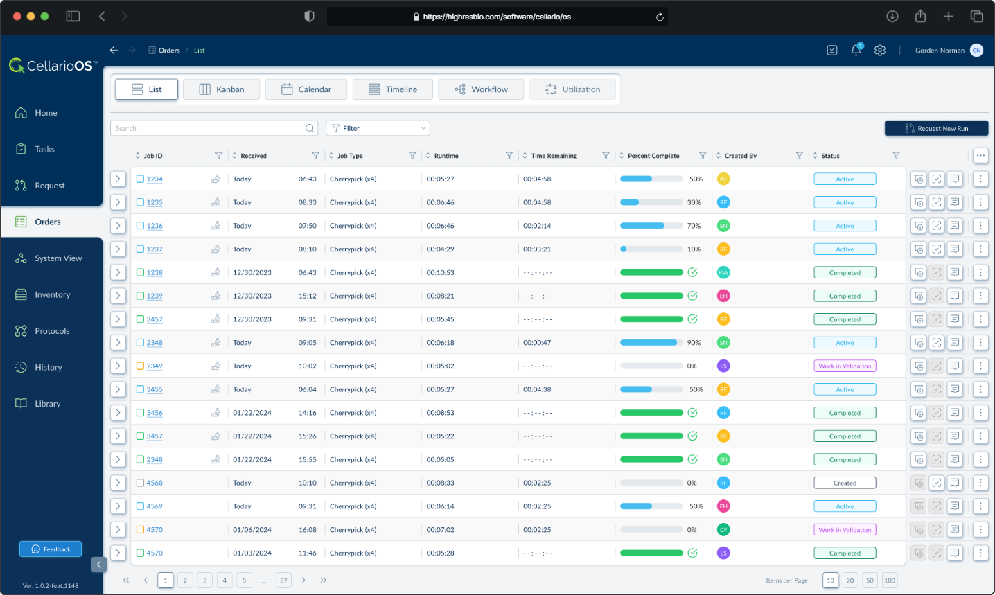
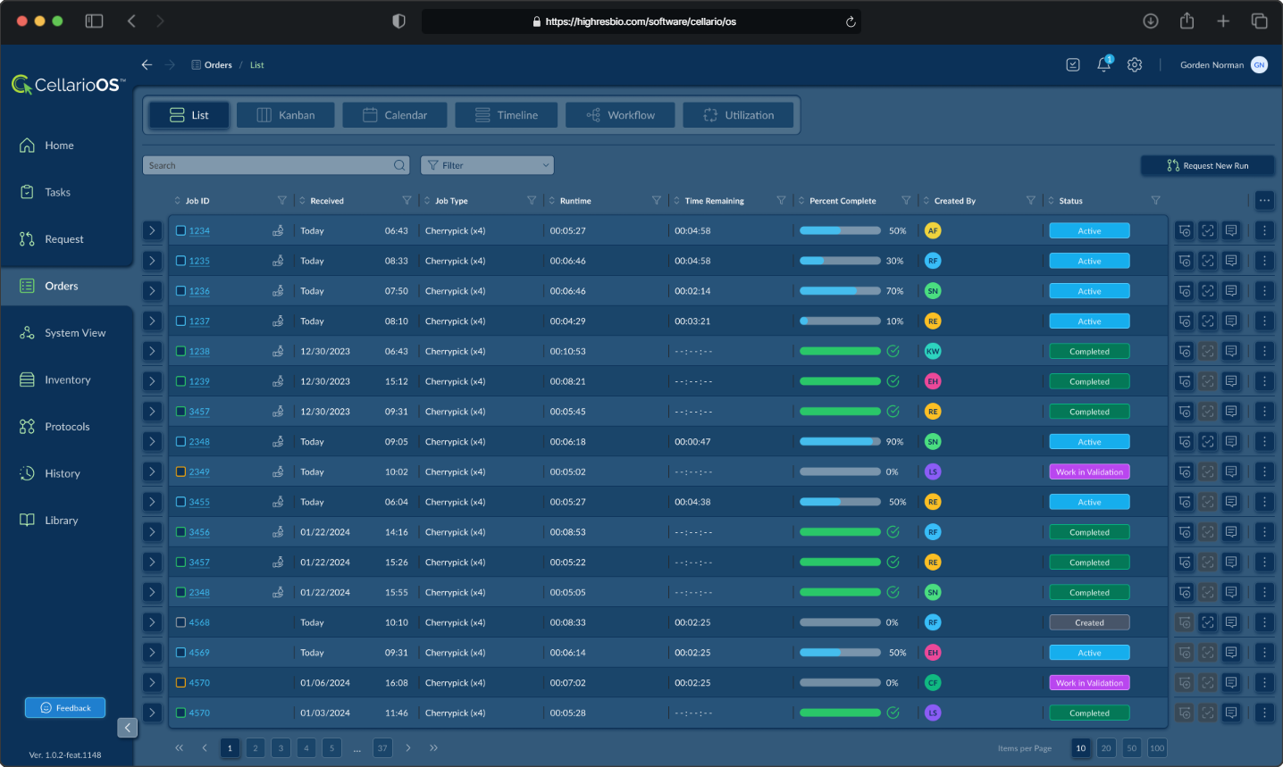
Lab managers and operators can scan through orders quickly, filter by various criteria, and identify which orders need attention based on their status or progress.
05.04. Scheduling
The calendar view displays orders across time, showing what is scheduled for each day.
Orders are color coded and display their ID and protocol type. This view allows lab personnel to see workload distribution, identify scheduling conflicts, and plan capacity. Users can toggle between month, week, and day views depending on the level of detail they need.
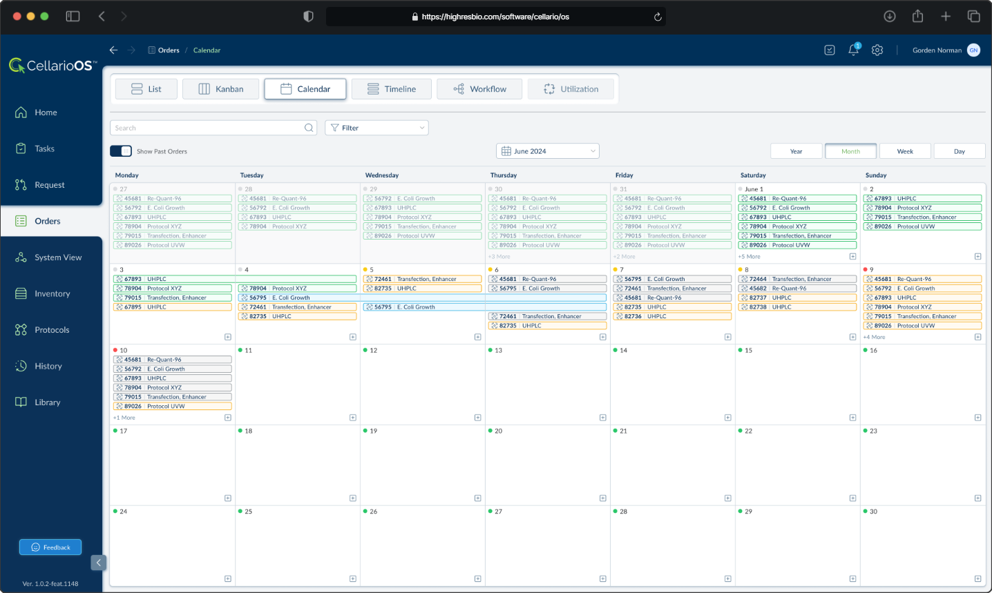
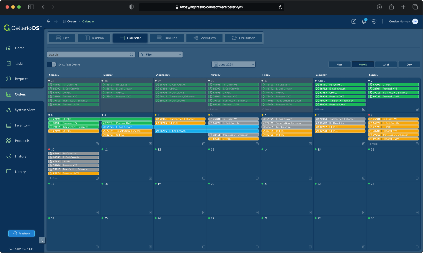
Both views are accessible from the same interface through a tab system that also includes Kanban, Timeline, Workflow, and Utilization views, allowing users to switch between different mental models depending on their task.
06. Outcome
I delivered the prototype Tuesday morning. The only response I received was a thank you. No feedback. No change requests. The entire day passed with nothing.
Then Wednesday afternoon, I received a message saying: "We got the contract."
It turned out that this existing customer had been evaluating software vendors to manage their lab automation orders and experiments. Their official submission deadline had passed around the time I first started at HighRes Biosolutions, but HighRes had received an exception to present after the deadline. Despite being late to the process, HighRes won the contract. The customer found the software concept aligned with what they were looking for.
The contract was in the seven figure range. The prototype I built in 8 days became the foundation for CellarioOS, and the design language I established carried forward into production and subsequent HighRes Biosolutions software platforms.
07. Continued Development
The design language became the foundation for every HighRes Biosolutions software platform that followed.
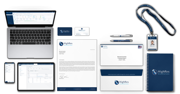
In the five years that followed, I extended the design into a company-wide design system spanning multiple products, a complete brand identity, and corporate collateral.
The second part of this case study documents that work.

