HighRes' Brand Identity
From Software to Company-Wide System
Overview
- Company-wide brand questionnaire
- Updated and expanded style guide and brand standards documentation
- Design system built in Figma with companion Confluence documentation
- Unified visual language across six software platforms
- Corporate collateral including business cards, stationery, and logo wear guidelines
- Presentation templates and reusable graphics library
- Trade show booth design for SLAS 2022, SLAS EU 2025, and Future Labs Live 2025
- Photography and video production for company events
My Role
- Sole designer responsible for brand strategy and execution
- Developed and administered company-wide brand questionnaire
- Updated and expanded style guide and brand standards documentation
- Built and maintained cross-platform design system
- Established direction for corporate collateral and presentation materials
- Designed booth graphics and event materials, prepared print-ready files, and coordinated with vendors
- Produced photography and video for internal and external use
00. Table of Contents
01. Context
Establishing why brand identity needed to extend beyond software.
02. Reading the Environment
Observing company culture before designing anything that represents it.
03. The Questionnaire
Capturing employee perception as data to support design decisions.
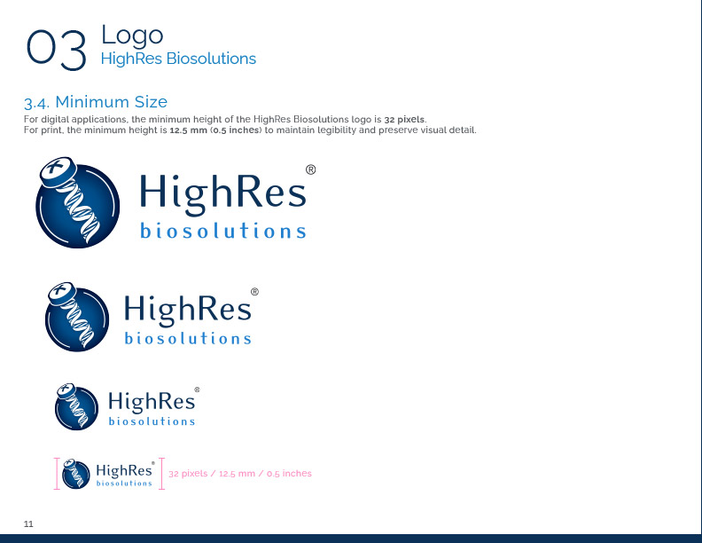
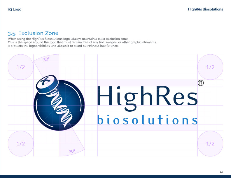
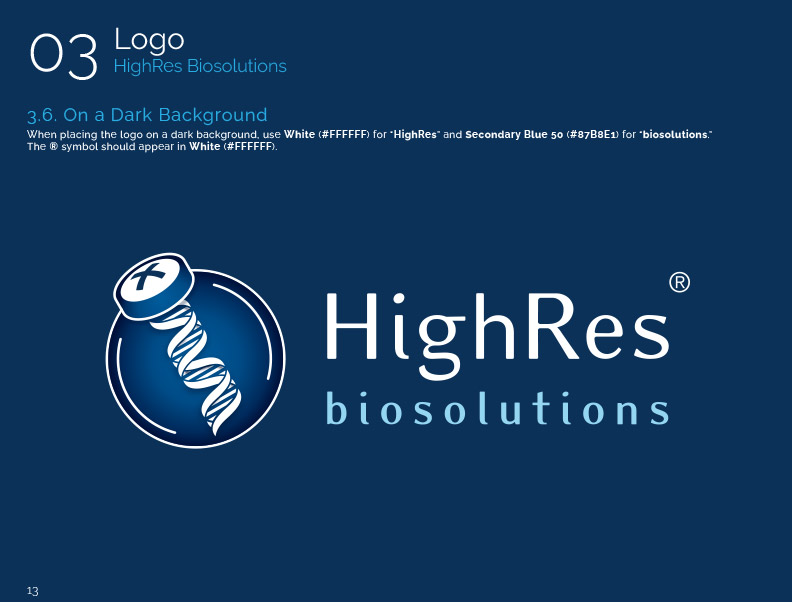
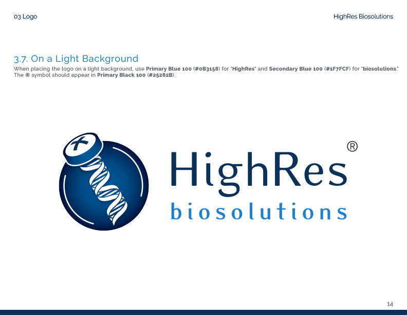
04. The Style Guide
Formalizing brand standards into nine documented sections.
05. Operationalizing Brand Voice with AI
Building a system that generates content matching the company's voice.
06. Unified UI Design Across Platforms
Applying consistent visual language across all software products.
07. Design System
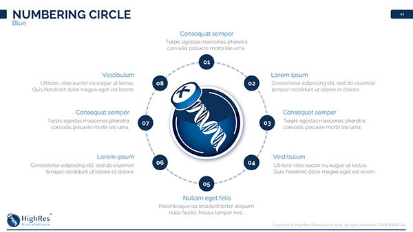
Building a 1,000+ component system accessible without onboarding.
08. Corporate Collateral
Business cards, stationery, and logo wear guidelines.
09. Presentation Design
Templates and reusable graphics for sales and technical teams.
10. Internal Design
Materials for internal communications with appropriate flexibility.
11. Event and Marketing Materials
Trade show booth design, photography, and video production.
12. Outcome
Five years of brand stewardship and system building.
01. Context
The first part of this case study documented how I created the visual language for CellarioOS by studying the industrial design of HighRes Biosolutions' hardware. That approach established the foundation: the color palette, the form language, and the relationship between physical and digital products.
But software is only one surface where a company's identity appears. The same visual language needed to extend into everything else: marketing materials, trade show booths, internal documents, presentation decks, and the way the company presented itself to customers, partners, and prospective employees.
Visual appeal without accurate representation fails in practice. These materials would appear in client meetings, sales presentations, and customer conversations. The design needed to function as an extension of the company itself, something employees could present with confidence because it reflected who they actually are.
02. Reading the Environment
I started forming an understanding of HighRes Biosolutions before I was even hired.
During the interview process, I paid attention to how people spoke about their work, how they described the company, how they interacted with each other, and what kind of questions they asked me. A conversation with HR also revealed what they valued in candidates and what kind of person fit the company culture.
Lab automation is among the most technically complex domains I have worked in. When I asked questions about high throughput screening (running thousands of biological or chemical tests in parallel to identify active compounds) or how a specific step in liquid handling (the automated transfer of precise volumes of liquids between containers) worked, people did not offer brief answers and return to their work. They made time to sit with me, walk through the subject thoroughly, and often the conversation would continue beyond the immediate question.
This is not something you encounter often. The CEO would explain concepts like input and output ports (the physical connection points where labware enters and exits automated systems, determining how samples move between instruments and storage) with the patience of someone who genuinely enjoyed teaching. You could see that approach reflected throughout the organization. Everyone I encountered was patient and willing to help, to the point where I kept asking myself, "Why is everyone so nice? Where is the catch?"
Understanding this culture was essential before I could design anything that represented it.
Art is self-expression. Design has to function. But when designing for a company, design becomes their self-expression. The work must represent them accurately. The longer I have worked in this profession, the better I have become at reading what people actually want, even when they cannot fully articulate it themselves.
It starts with paying attention.
03. The Questionnaire
While I had a strong sense of what HighRes Biosolutions' identity was based on observation, I wanted that understanding captured as data so every design decision could be supported.
I ran a company-wide questionnaire, which I had developed and refined over years of brand and corporate identity work at my agency across many different clients and industries. From that experience, I learned that people disengage when faced with endless questions, a phenomenon known as respondent fatigue in survey methodology research. Response quality degrades as questionnaire length increases. Attention drops, people rush through answers, and open-ended responses become shorter or are skipped entirely.
The questionnaire has few questions, but each one is designed to surface a significant amount of information by drawing from established techniques in psychology and brand research:
- Projective Techniques:
Asking people to describe a brand as if it were a person or to attribute personality traits to it. This bypasses rational filtering to reveal how people actually perceive something. - Semantic Differential Scales:
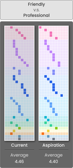
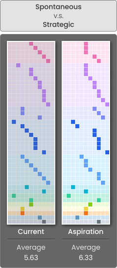
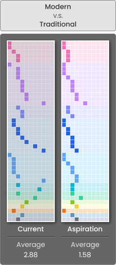
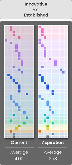
Presenting opposing adjective pairs (professional vs. casual, innovative vs. traditional) and asking respondents to place the brand somewhere on that spectrum. This reveals positioning perceptions efficiently. - Gap Analysis Questioning:
Asking about current state versus desired state. The distance between the two answers reveals where effort should be directed.
The questionnaire asked employees which year they joined, what they believed the company's voice was, how they perceived the current brand personality, what personality they believed the company should aim for, how satisfied they were with existing corporate identity materials, and whether they had additional comments or suggestions.
The results confirmed what I had observed.
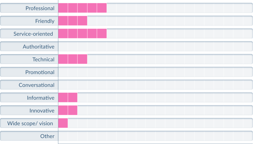
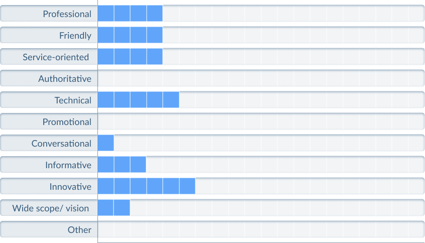
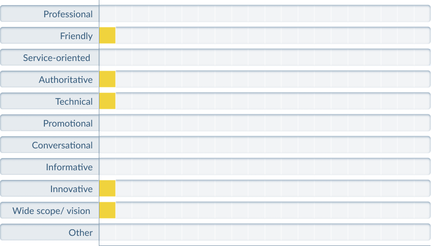
When asked about the company's voice, the most common responses clustered around terms like knowledgeable, professional, and approachable.
What is HighRes Biosolutions' voice(s)?
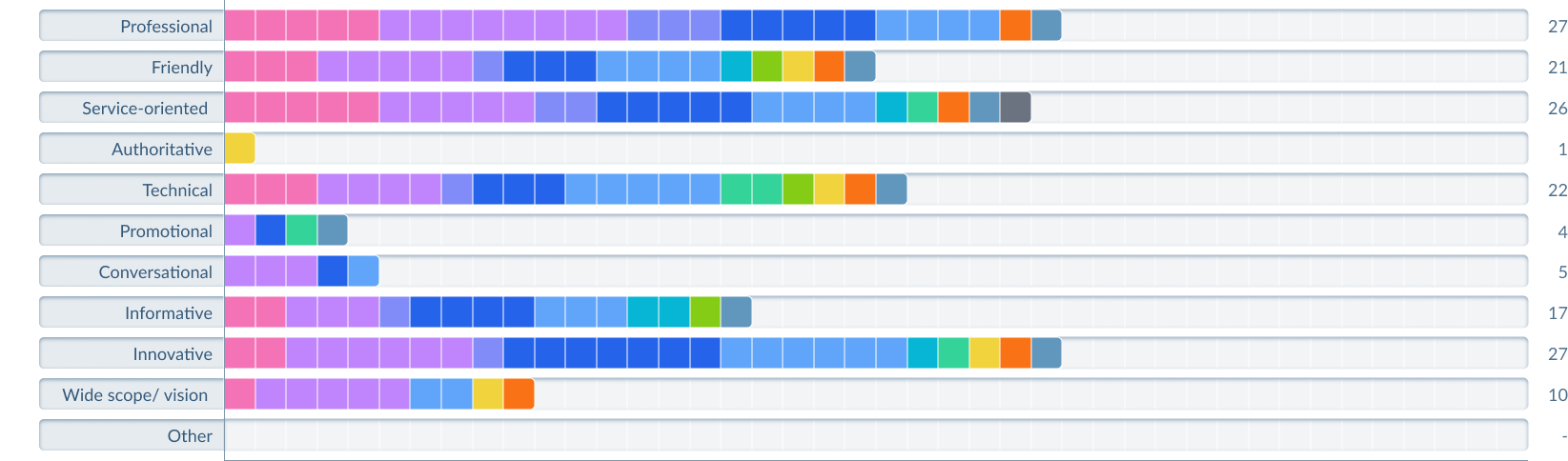
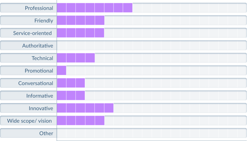
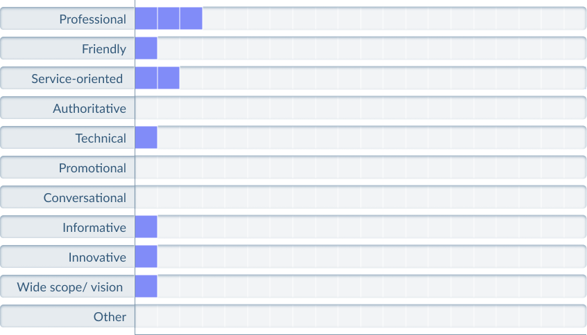
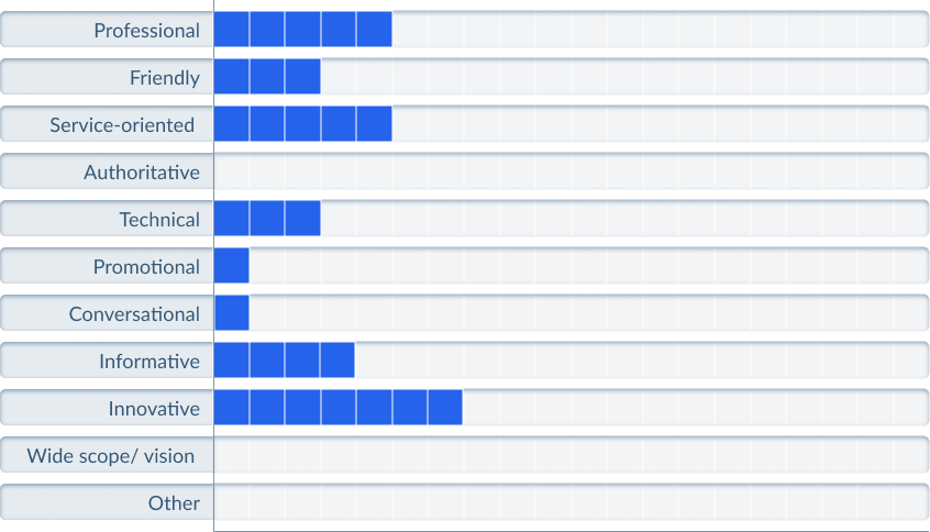
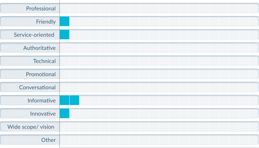
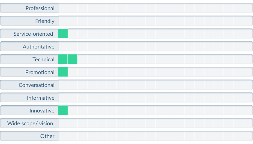
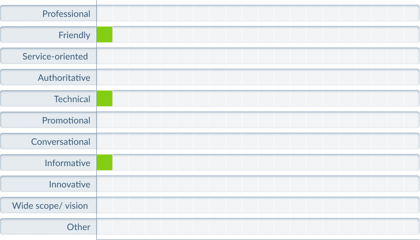
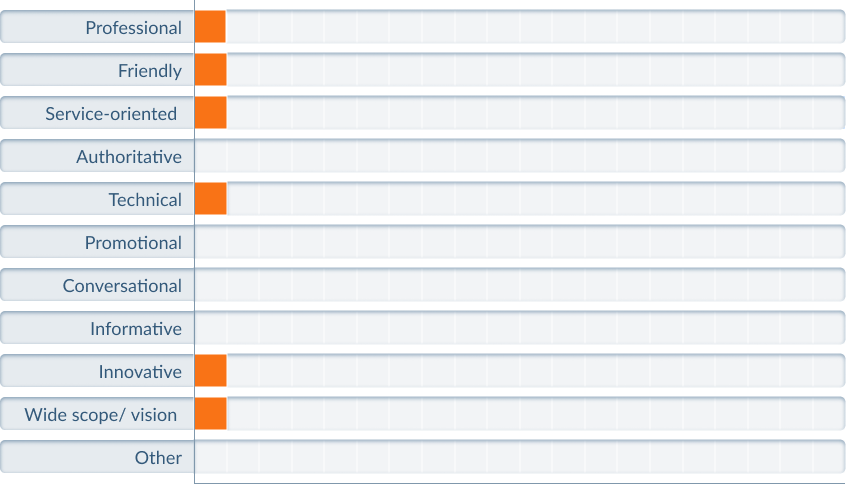
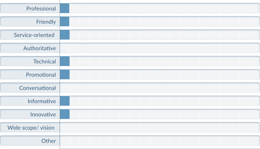
When asked about current brand personality versus target personality, the gap showed where employees felt the company was not yet living up to its potential.
What is the personality of HighRes Biosolutions' brand?
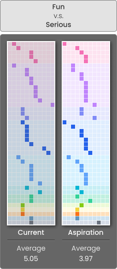
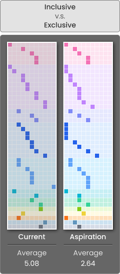
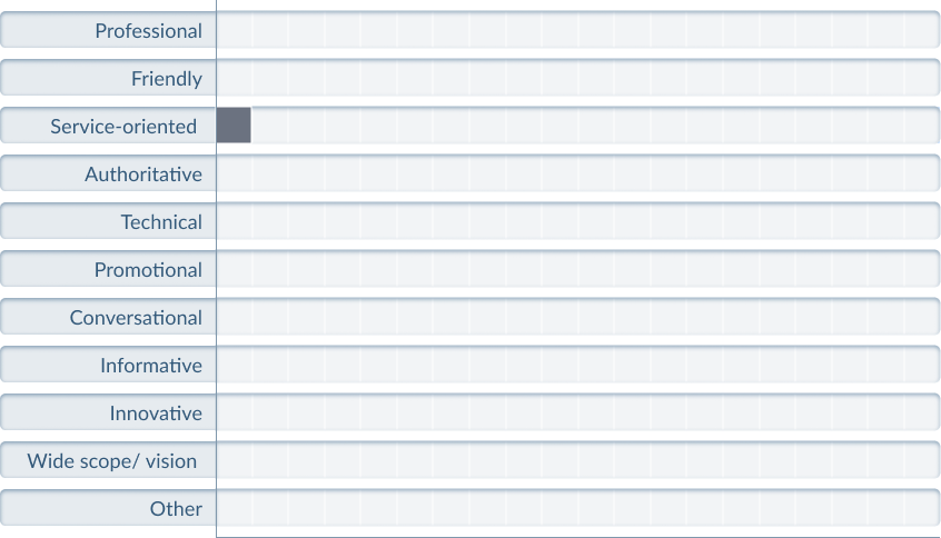
Satisfaction with existing corporate identity averaged 3.57 out of 5.
Looking at our current existing designs (Brochures, Website, Products, etc.), how satisfied are you?


The open-ended responses provided more detail.
Several patterns became apparent across responses:
On professionalism without character:
- "Everything we have right now is cohesive and professional, well put together, but to me lacks a certain soul"
- "Clean and crisp and sterile... nothing that makes me remember HighRes specifically"
On inconsistency:
- "There's a lot of inconsistency, especially with different versions of our brand, across documents, sites, and products"
- "It is nearly impossible to find up-to-date images, brochures, or any promotional material"
- "We suffer from discontinuity in style and naming across all our customer facing documents and software"
On positioning:
- "Somewhat outdated and at times very unclear as to what exactly we do as a company"
- "We have the expertise, but it only comes through when talking to us"
On people as the strength:
- "The people at HighRes make the company great"
- "Customers claim that what they like best about us is that we listen to feedback, and our support is tailored to them"
This last point aligned with what I had observed during onboarding:
A culture of patience and willingness to help.
One of the principles I followed was not to change a working system. The questionnaire helped me identify what employees valued and wanted to preserve, so I would not accidentally discard something that was core to the company's identity. It also showed me where the gaps were and where improvement would be welcomed.
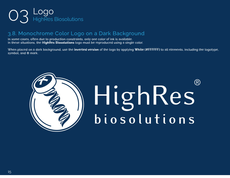
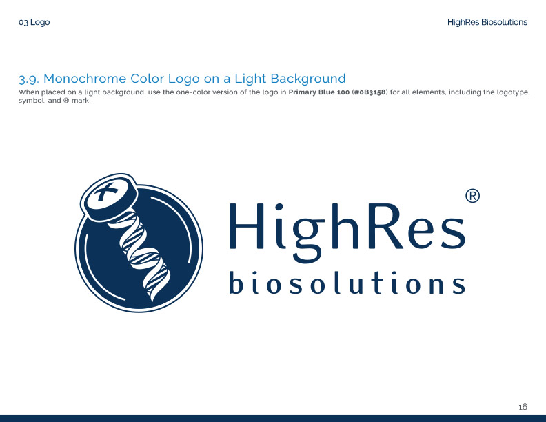
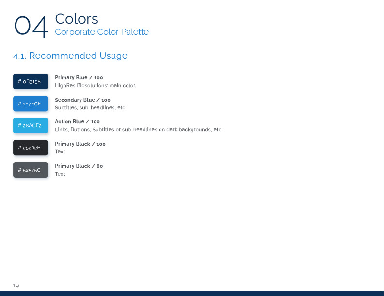
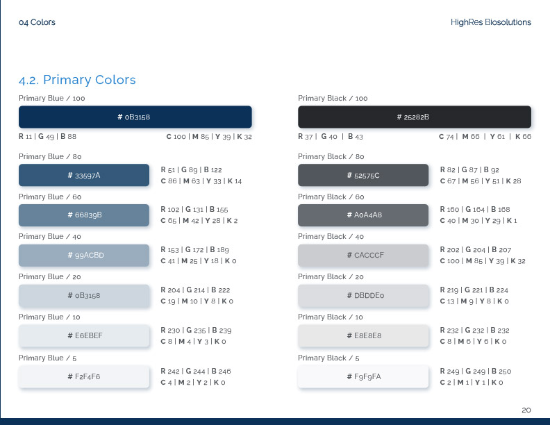
04. The Style Guide
The questionnaire results, combined with the visual language established during the CellarioOS project, gave me enough foundation to formalize brand standards.
I structured the style guide into nine sections:
- Company overview, brand identity principles, business areas, and messaging
- Trademark usage
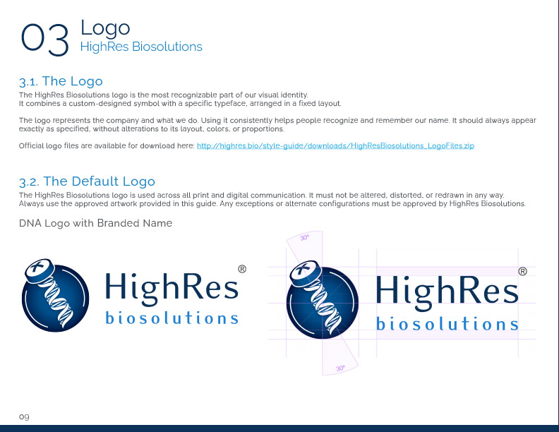
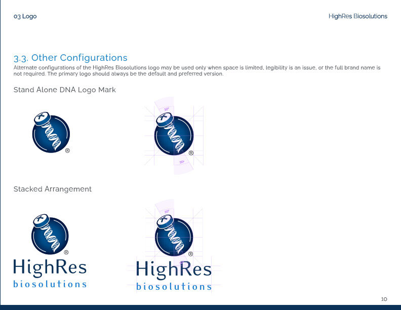
- Logo configurations and applications
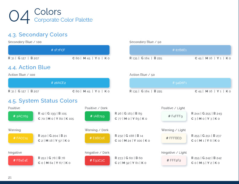
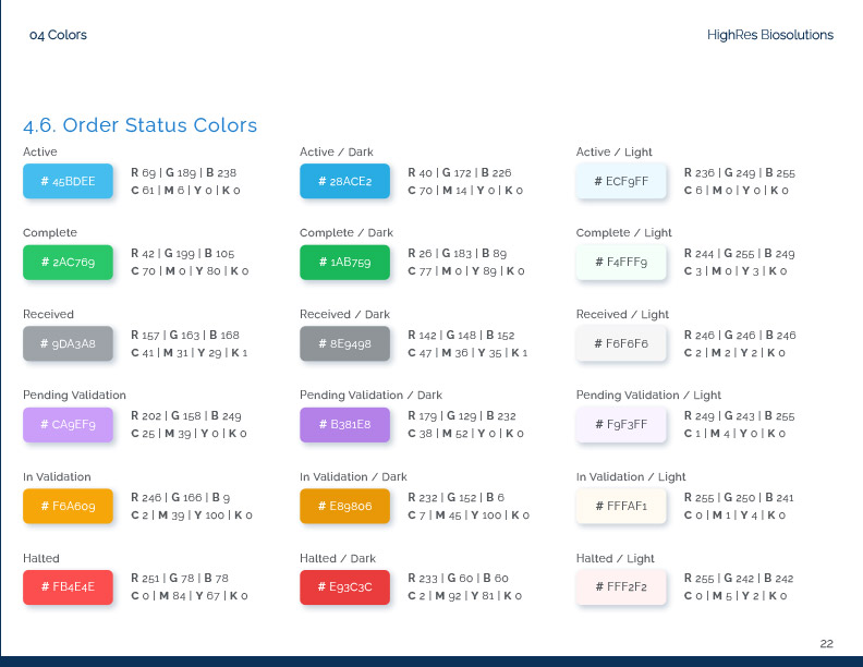
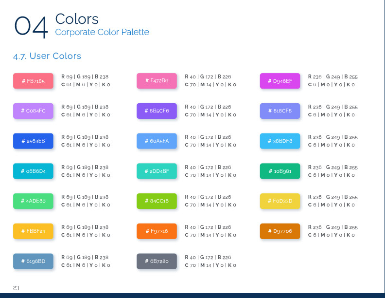
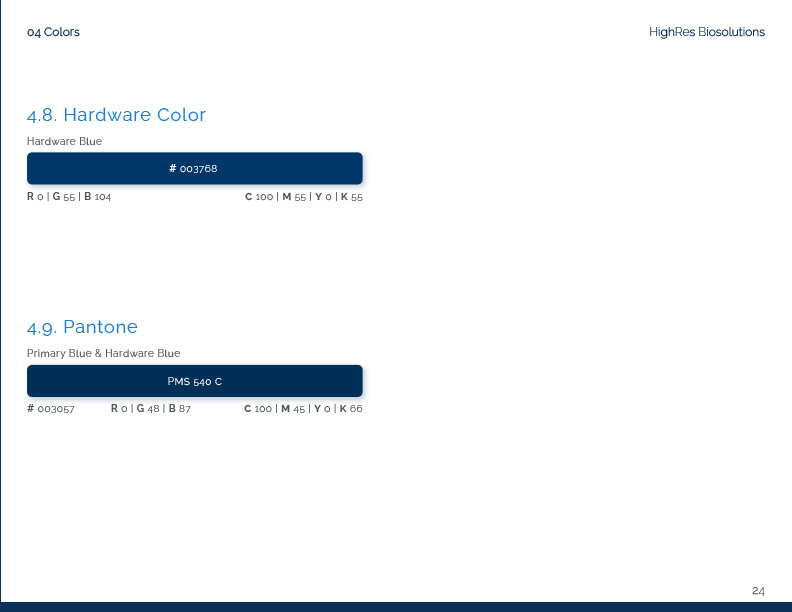
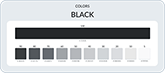
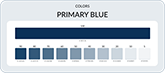
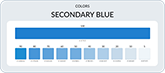
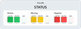
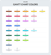
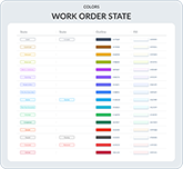
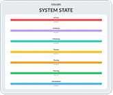
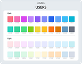
- Color systems (including primary, secondary, status colors, and hardware-specific colors with Pantone references)
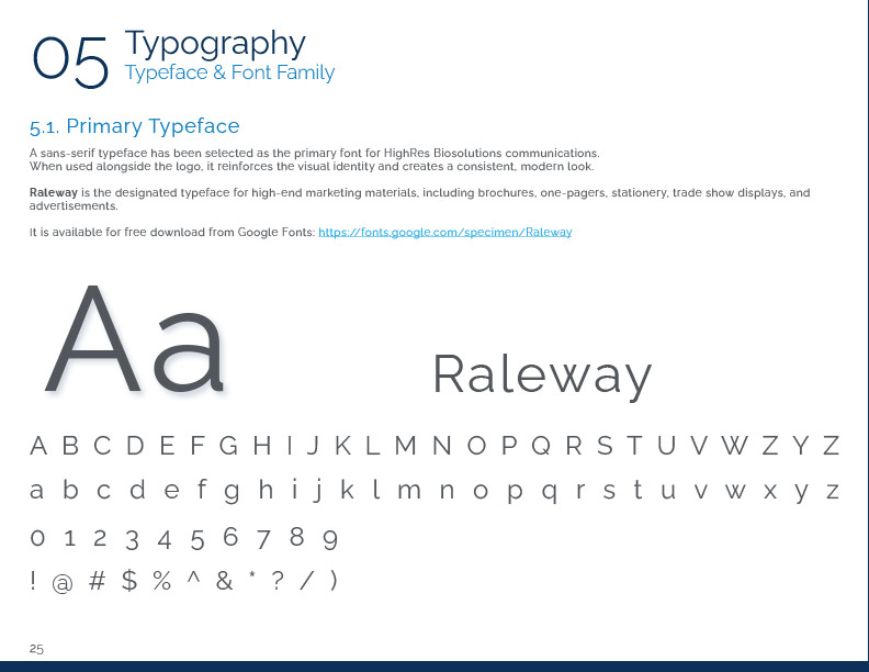
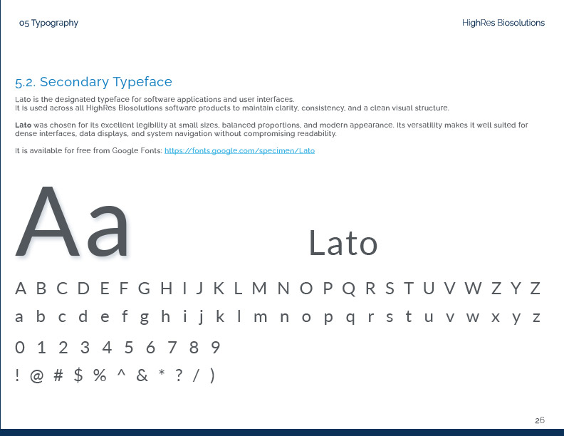
- Typography
- Audio and visual standards
- Print and digital media templates
- Logoware guidelines for apparel and accessories
- Stationery
The following pages provide a sense of the guide's structure and format.
05. Operationalizing Brand Voice with AI
The questionnaire established what the brand voice should be. The style guide documented it. But documentation alone does not guarantee consistent execution. People across the company write emails, presentations, proposals, and marketing materials. Without active support, voice drift is inevitable.
I built a system that allows anyone at HighRes Biosolutions to generate written content that matches the company's brand voice using AI.
05.01. Corpus Collection
The first step was gathering all existing written materials that represented how HighRes Biosolutions communicates.
This included:
- Product brochures
- Client presentations
- Internal presentations
- Website copy
- Explainer videos (transcribed)
- Published interviews with company representatives
- Marketing materials from SharePoint
This collection formed the reference dataset against which all AI output would be measured.
05.02. Establishing Analytical Framework
Before asking the AI to analyze the materials, I first trained it on linguistic and rhetorical frameworks. This gave the AI a vocabulary to describe what it was observing, which produces more precise and actionable analysis than asking it to simply "describe the writing style."
The AI needed to understand concepts like sentence structure variation, terminology density, tone registers, rhetorical positioning, and audience calibration before it could apply those lenses to the source materials.
05.03. Stylometric Analysis
With the framework in place, I fed the AI the collected materials and asked it to analyze:
- Word choice patterns and preferred vocabulary
- Sentence structure and length variation
- Technical terminology frequency and placement
- Tone and register consistency
- Rhetorical patterns (how claims are supported, how benefits are framed)
- What is emphasized and what is understated
- How complexity is handled (simplified vs. assumed knowledge)
The output was a detailed breakdown of how HighRes Biosolutions writes, not just what it says.
05.04. Prompt Engineering
Using the stylometric analysis, I wrote a set of instructions that would guide the AI to replicate the identified patterns. This is prompt engineering: crafting precise directives that shape AI output toward a specific target.
The prompt structure followed established patterns in large language model instruction design, using explicit categorical markers to reduce ambiguity and improve consistency:
- Critical:
Non-negotiable rules that override all other instructions. - Banned Patterns:
Specific behaviors, phrases, or formats the model must avoid. - Required Patterns:
Behaviors and formats the model must follow. - Context Rules:
Background information that shapes interpretation. - Execution:
Self-check instructions applied before output.
This structure improves consistency in how the model applies instructions across different content types. The instructions codified everything from vocabulary preferences to sentence rhythm to how technical concepts should be introduced and explained.
05.05. Iterative Refinement
The first outputs were close but not accurate. Refinement followed a structured loop:
- Generate a test article long enough to reveal patterns
- Compare the output against the original corpus
- Identify deviations (where the AI drifted from the target voice)
- Adjust the prompt instructions to correct for those deviations
- Repeat
Each cycle narrowed the gap between AI output and authentic HighRes Biosolutions writing.
I continued until results were not only accurate but consistently replicable across different content types.
05.06. Validation
The final validation was comparison-based. AI-generated content was measured against the source materials using the same stylometric criteria established at the beginning. When the analysis showed alignment across vocabulary, structure, tone, and rhetorical patterns, the system was complete.
The result is a tool that anyone in the company can use to draft content that sounds like HighRes Biosolutions, without needing to internalize the style guide or guess at tone.
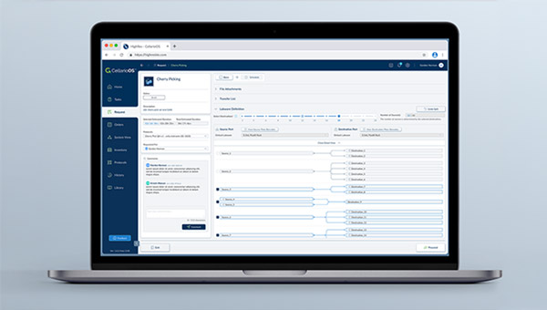
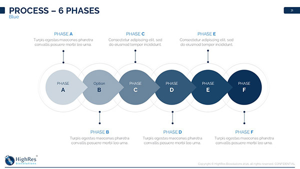
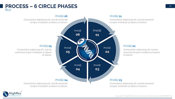
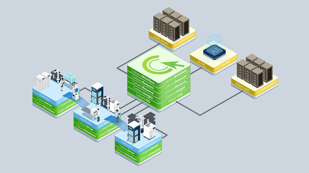
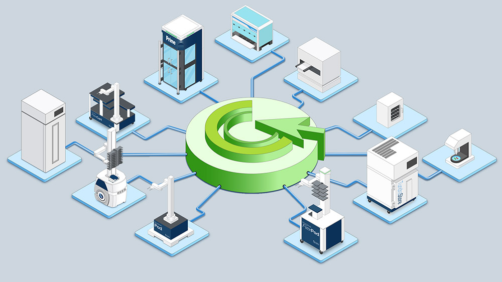
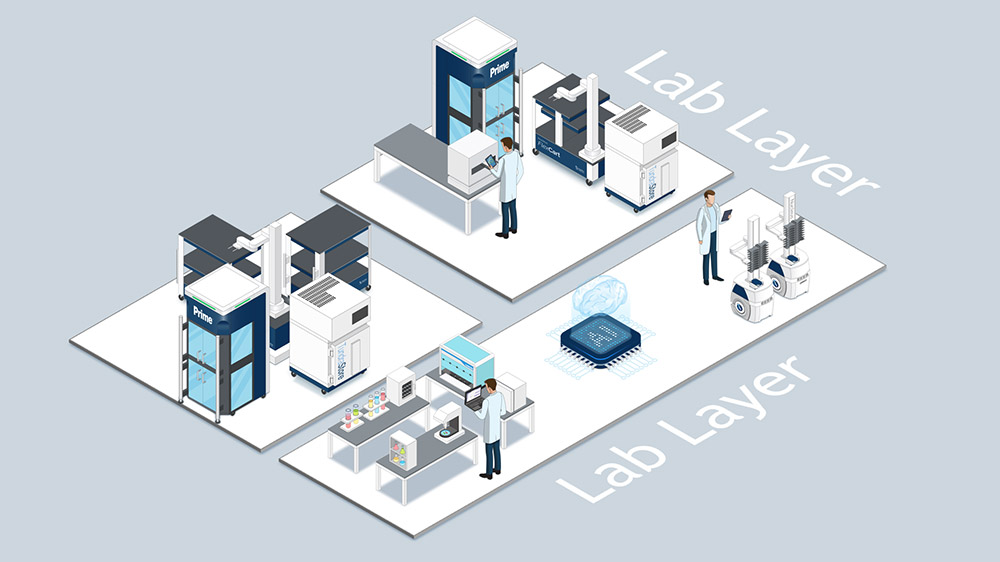
06. Unified UI Design Across Platforms
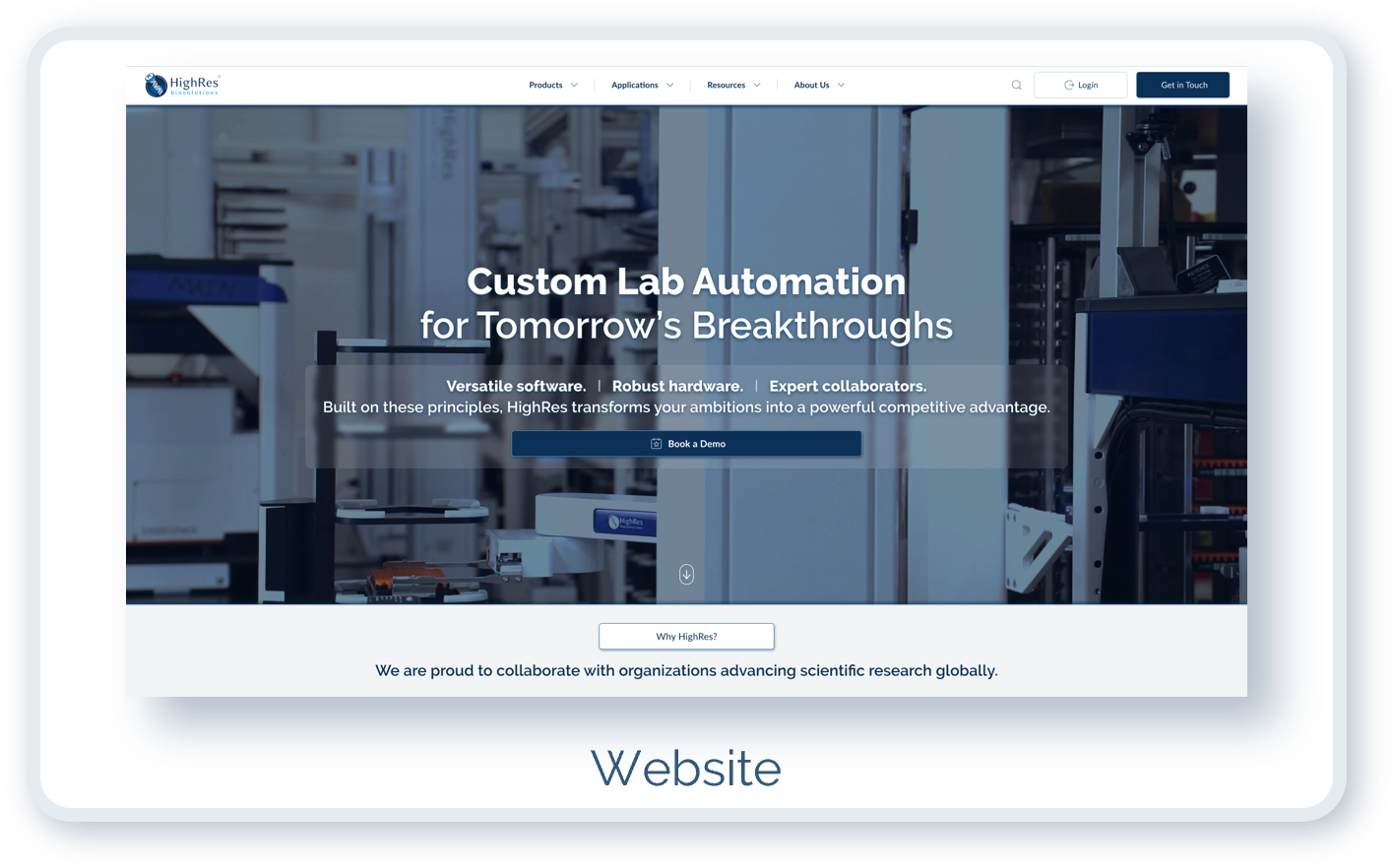
HighRes Biosolutions had multiple software products: CellarioOS, CellarioScheduler, CellarioConnect, Solution, and the SteriStore interface. Each had been developed at different times with different visual approaches. The website existed as another surface with its own design history.
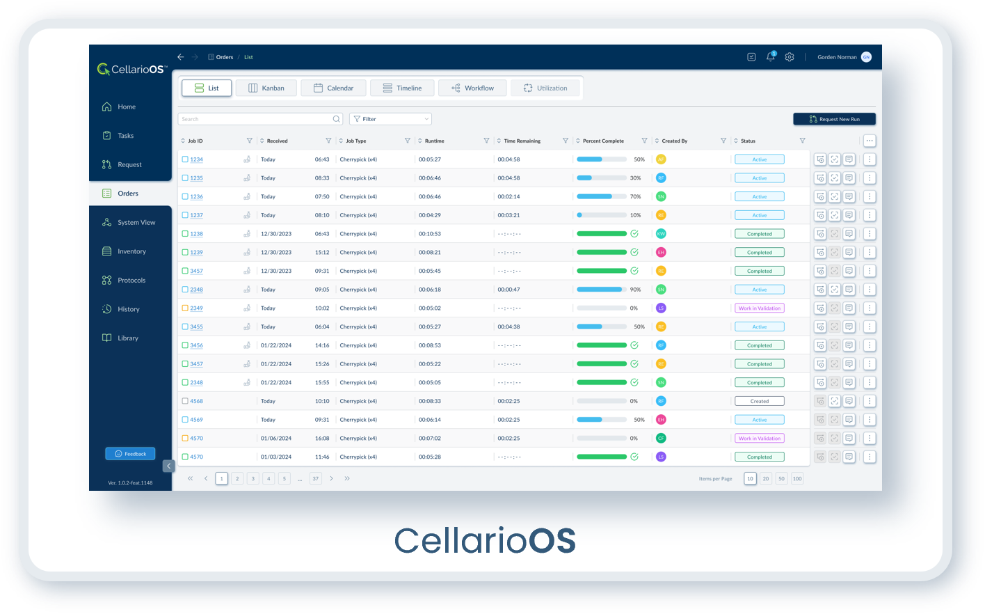
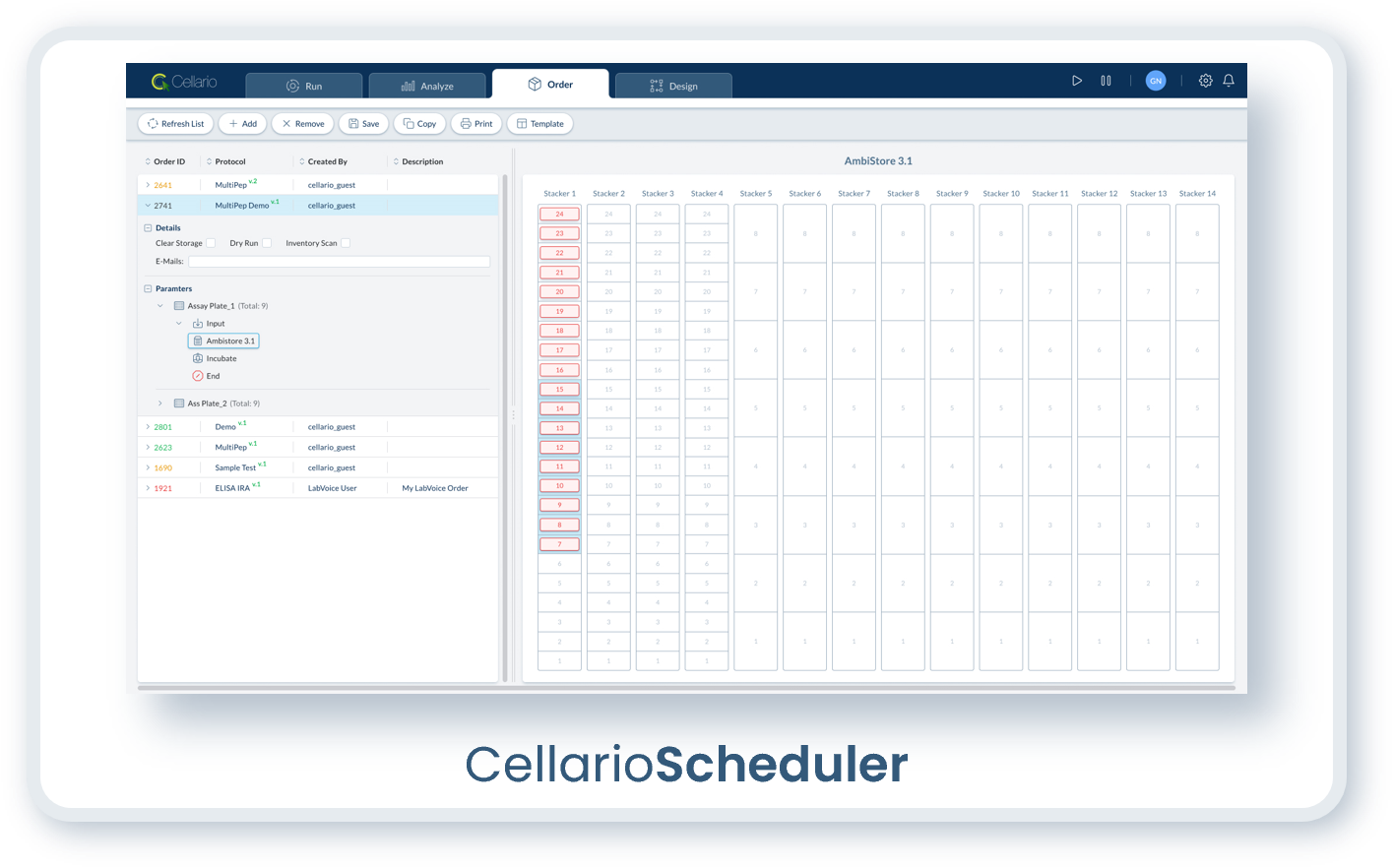
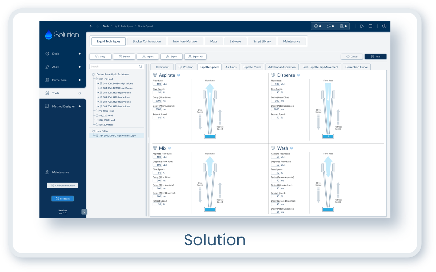
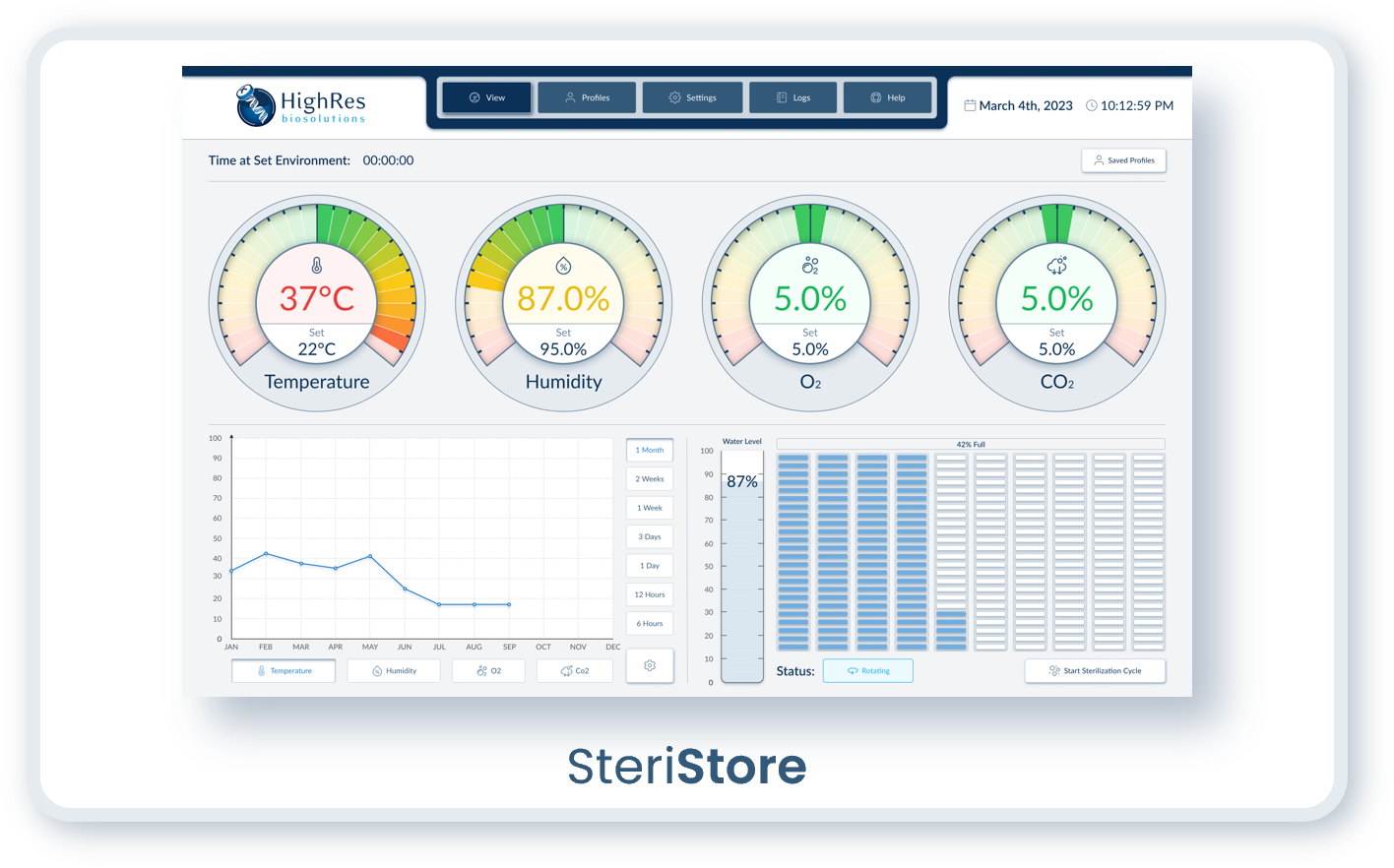
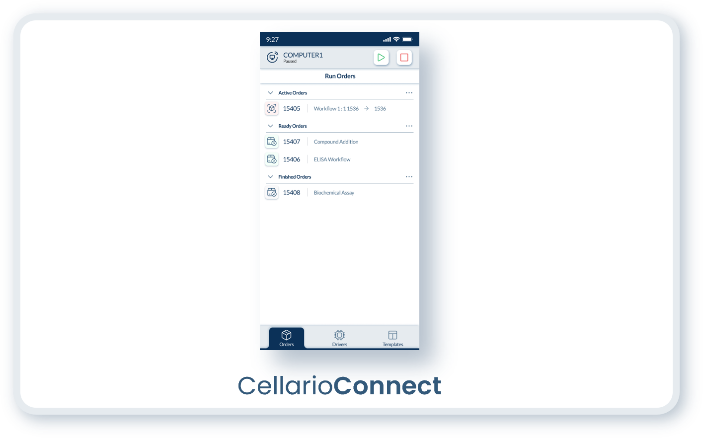
I unified all of them under the same visual language.
The color system, typography, component styles, and interaction patterns became consistent regardless of which product a user encountered. Someone moving between CellarioOS and CellarioScheduler would recognize them as part of the same family.
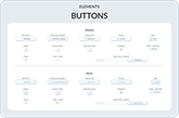
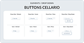
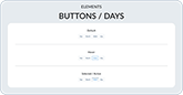
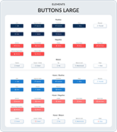
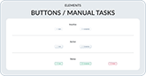
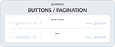
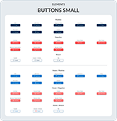
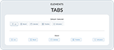
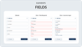
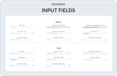
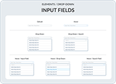
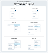
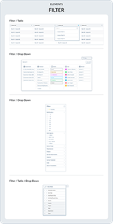
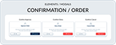
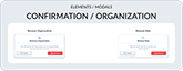
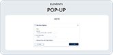
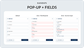
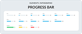
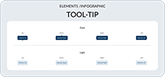
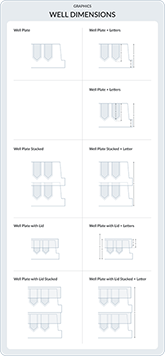
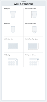
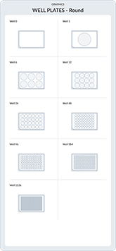
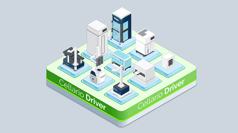
07. Design System
I built a design system that serves as the foundation for all HighRes Biosolutions platforms.
Typography, iconography, color tokens, spacing, and component architecture are shared across products. What differs between platforms is functionality and user workflows, which falls into UX territory. The visual language remains consistent.
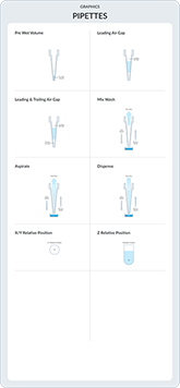
The system includes over 1,000 components and elements, built over five years of continuous development.
Many of these are custom icons designed specifically for the lab automation domain.
Standard icon libraries do not account for concepts like plate handling, instrument states, or scheduling conflicts in automated workflows. These required original development.
I structured and organized the design system so that components are easy to locate without relying on search functionality, which Figma's free tier does not include. Many people at HighRes who needed access to design assets were not daily Figma users and did not have paid seats. The organization had to compensate for that limitation.
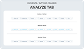
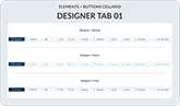
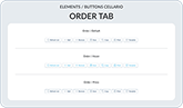
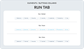
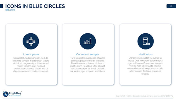
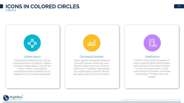
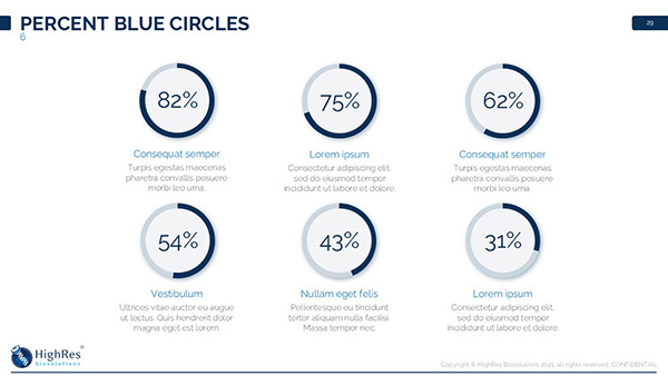
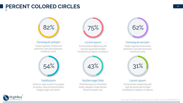
The images below show a selection of components from the system. Within the design system, components are organized alphabetically within categorical groups.


The system is self-explanatory by design. New hires, including software engineers, do not require onboarding on how the visual system works. Once they have access to the Figma project, the system is navigable without additional guidance. This was confirmed in practice: in five years, I never received questions about how the design system works.
A companion Confluence page documents everything in detail, mirroring the Figma structure and providing guidance on component usage and implementation best practices. This approach avoided recurring subscription costs while making the system accessible to the entire company.
The goal was to build a system for the system.
By eliminating ambiguity and reducing dependency on me for routine questions, this freed capacity for forward-looking work:
feature development, workflow improvements, and design exploration.
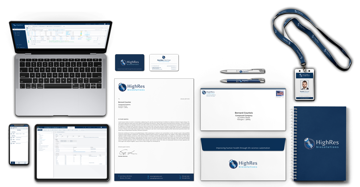
08. Corporate Collateral
The brand extended into physical materials.
I designed business cards, letterhead, and stationery that followed the established visual language.
08.01. Logo Wear
Uniforms play a key role in reinforcing a company's brand image, especially at high visibility events like conventions:
- Brand Recognition:
Attendees are more likely to remember a company when its representatives wear coordinated apparel. - Credibility and Trust:
Uniforms create a unified and professional impression, signaling reliability and attention to detail. - Team Identity:
Coordinated clothing fosters a sense of unity among team members, making them easily identifiable to clients and colleagues. - Minimizes Visual Clutter:
Reducing variation in colors and styles prevents distraction. Focus remains on the brand and its message.
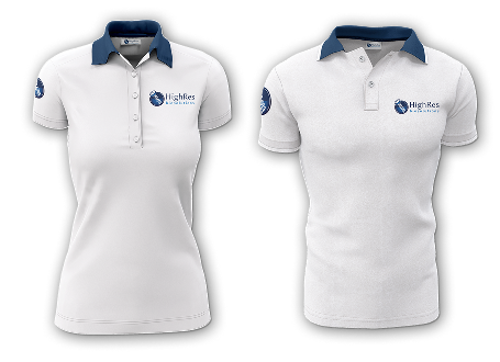
White Polo Shirt with Blue Collar
- Worn by team members demonstrating software and related technologies.
- Highlights approachability and accessibility, reflecting the software's user friendly and intuitive design.
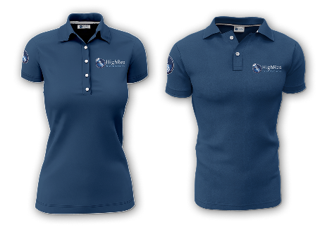
Blue Polo Shirt
- Worn by team members representing hardware products.
- Reinforces a strong and recognizable brand presence, matching the technical nature of hardware.
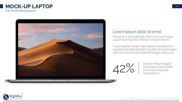
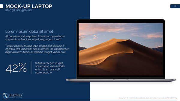
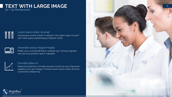
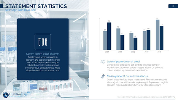
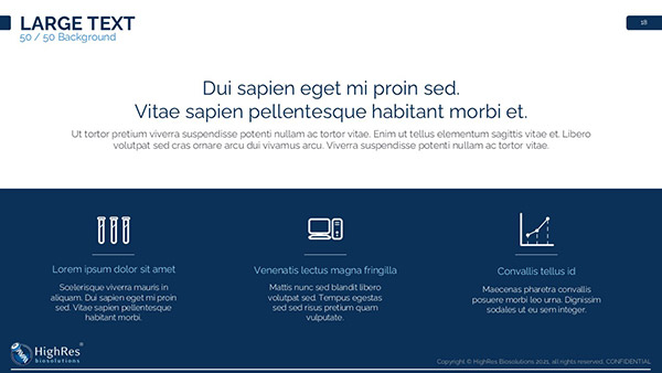
09. Presentation Design
Sales and technical teams needed presentation materials they could use with customers.
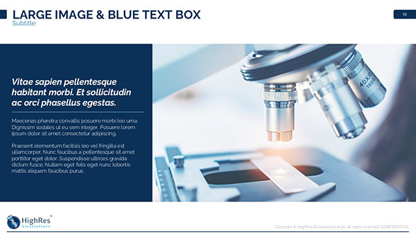
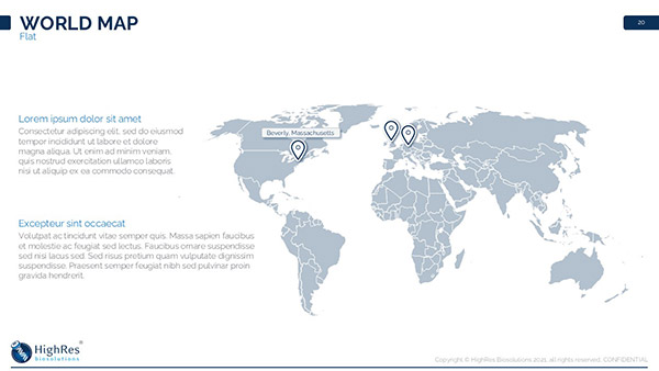
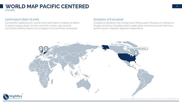
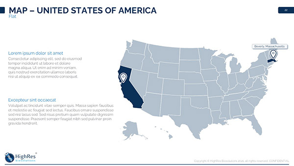
I created PowerPoint templates that maintained brand consistency while being flexible enough for different content types. The slides below are a selection from the full template library.
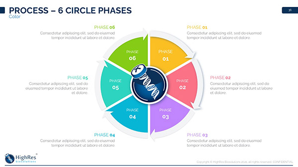
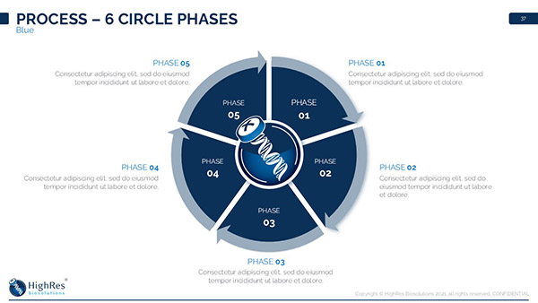
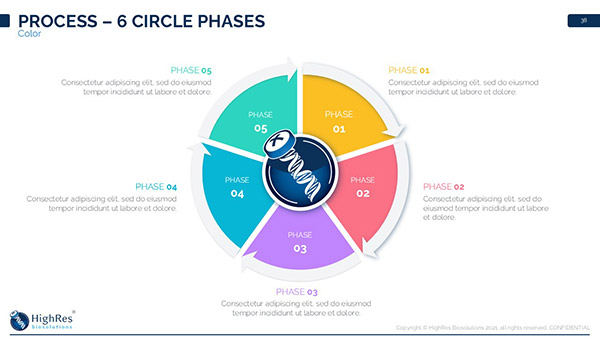
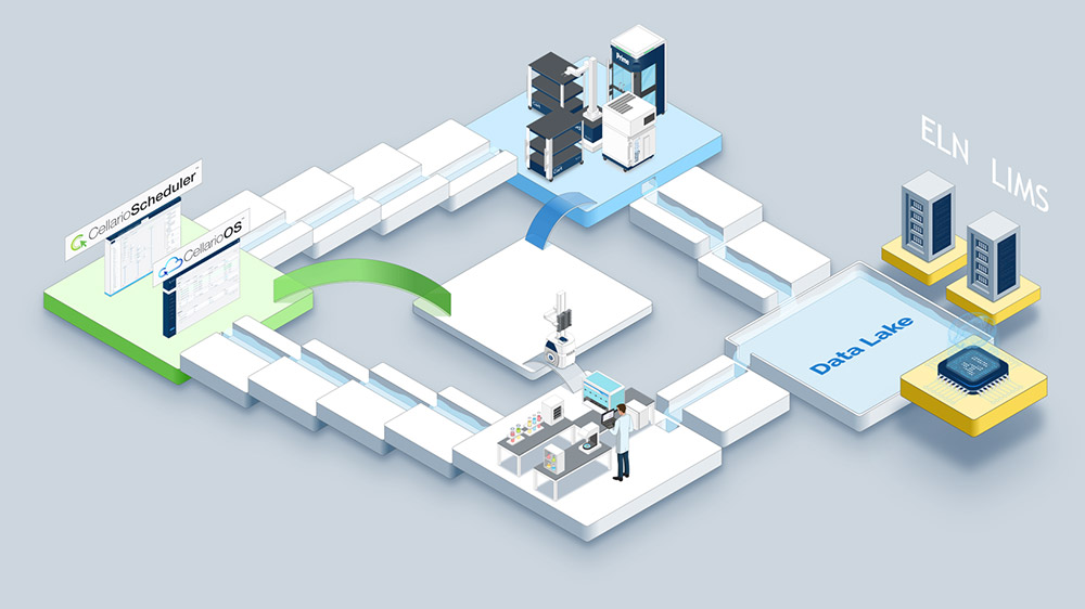
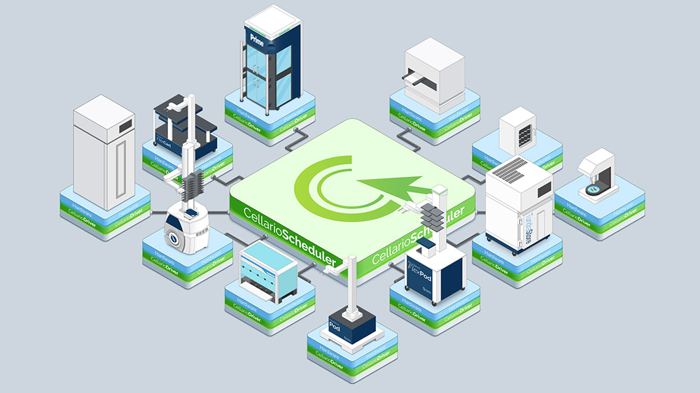
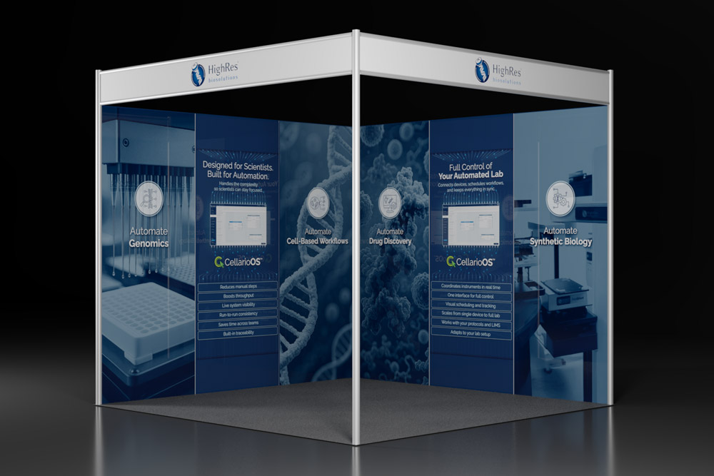
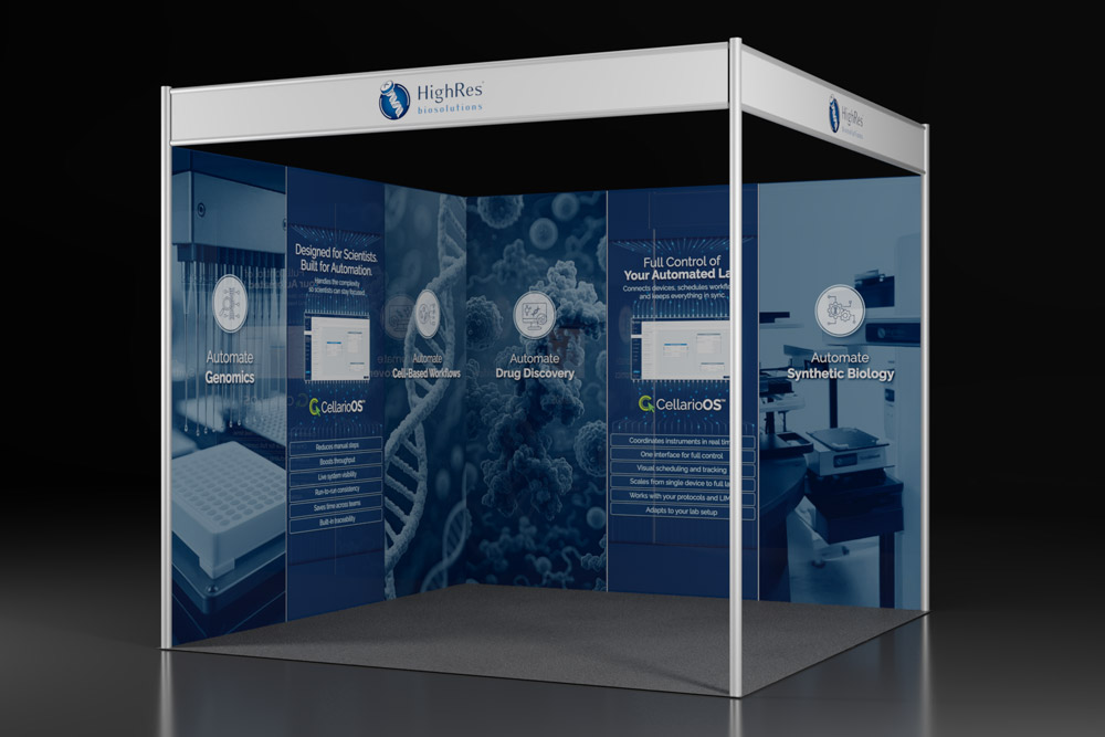
Beyond templates, I developed a library of reusable graphics.
Isometric illustrations were the primary format because the projection maintains consistent scale without perspective distortion, making it possible to show how instruments connect, how samples flow between stations, and how modular components integrate within a system.
The images below are a selection of isometric illustrations I created in Adobe Illustrator, depicting HighRes hardware devices.

These individual graphics served as building blocks. People across the company could assemble them into system diagrams, workflow visualizations, and infographics showing complete lab configurations.
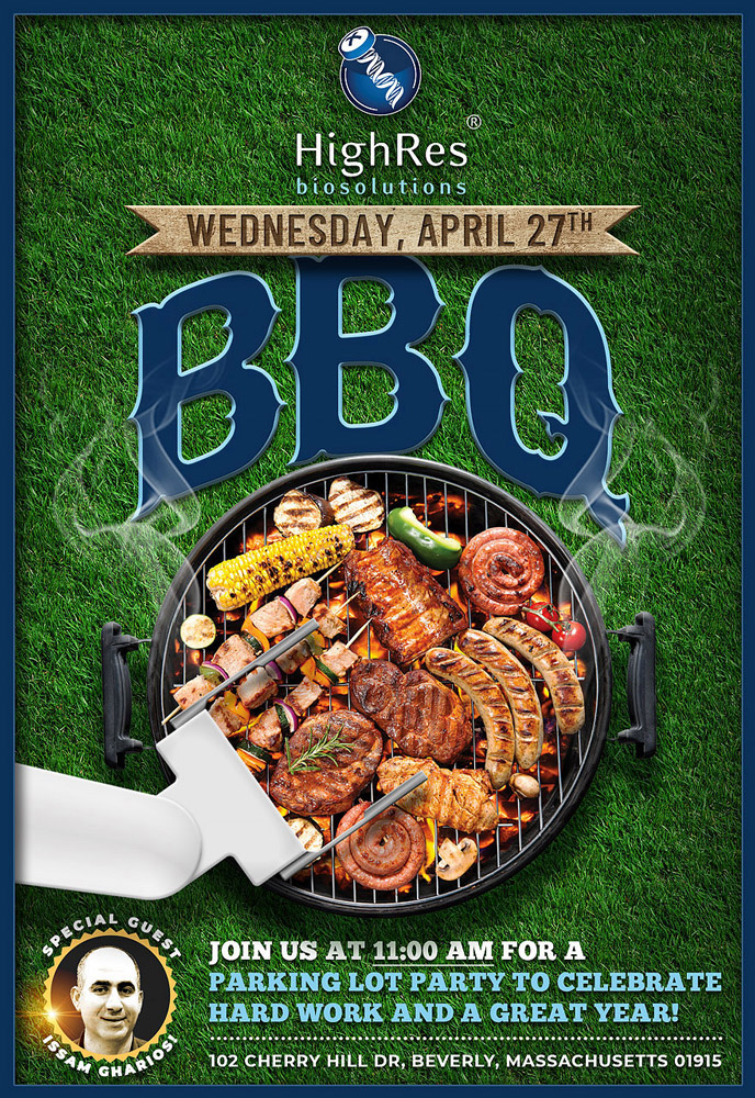
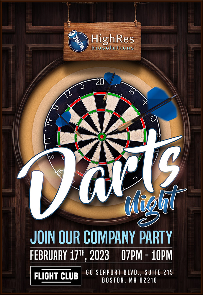
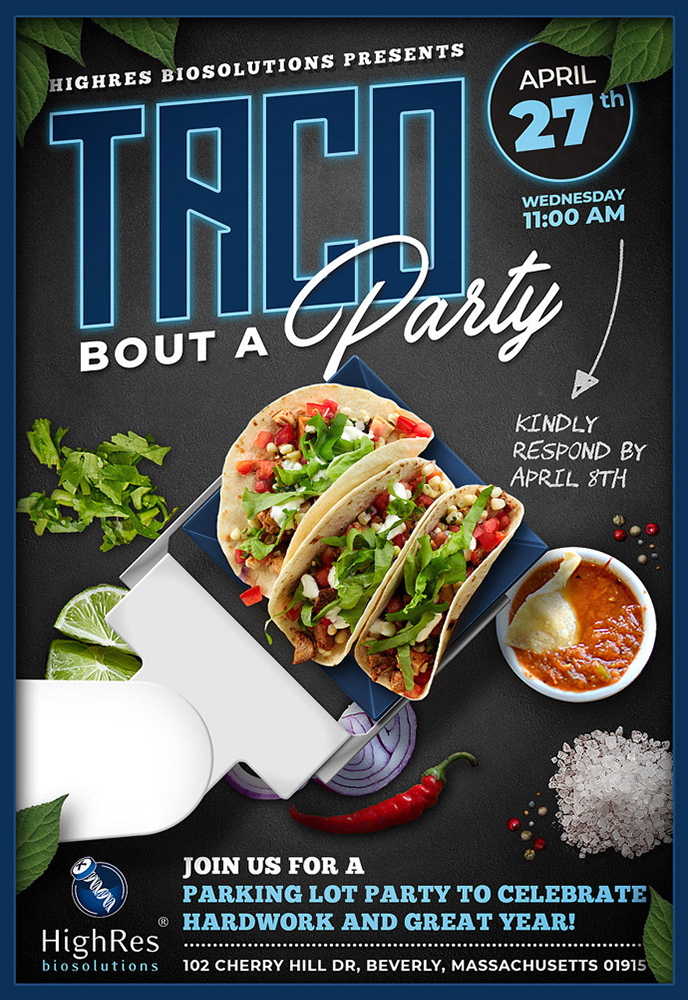
10. Internal Design
Not everything followed the external brand guidelines strictly. Internal materials served different purposes and different audiences. Team communications, internal announcements, and company event materials needed their own approach.
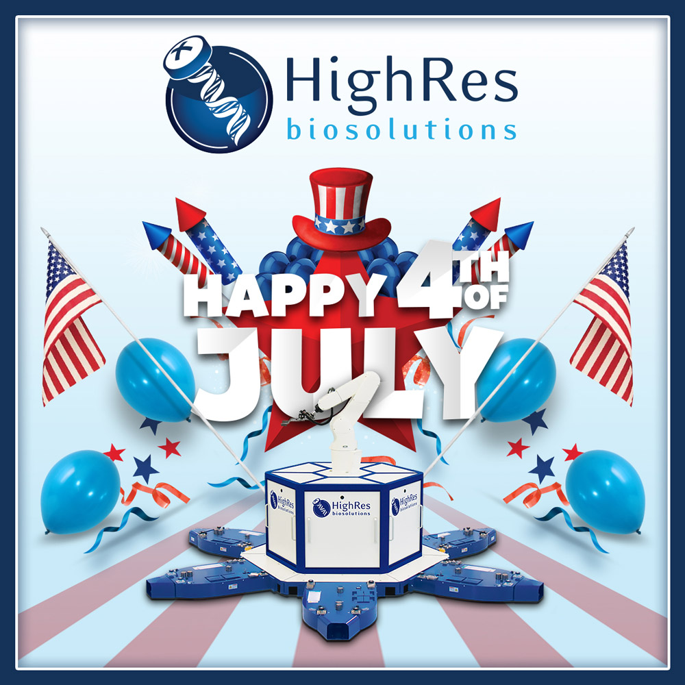
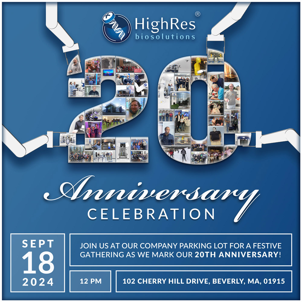
For internal company events and parties, the goal was to design flyers that break away from formal corporate identity while maintaining a connection to the brand. These designs are meant to feel more casual, vibrant, and engaging to reflect the celebratory and social nature of the events, while still being recognizable as part of HighRes Biosolutions.
11. Event and Marketing Materials
11.01. Trade Show Booths
Trade shows were a significant part of how HighRes Biosolutions reached customers. I designed booth graphics for:
SLAS 2022
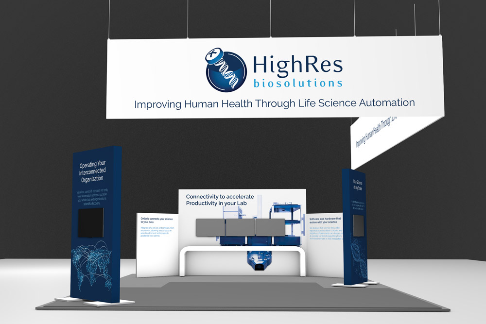
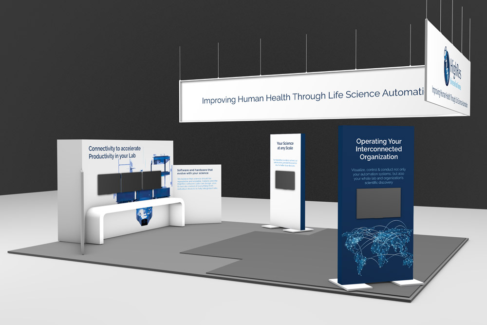
SLAS 2025
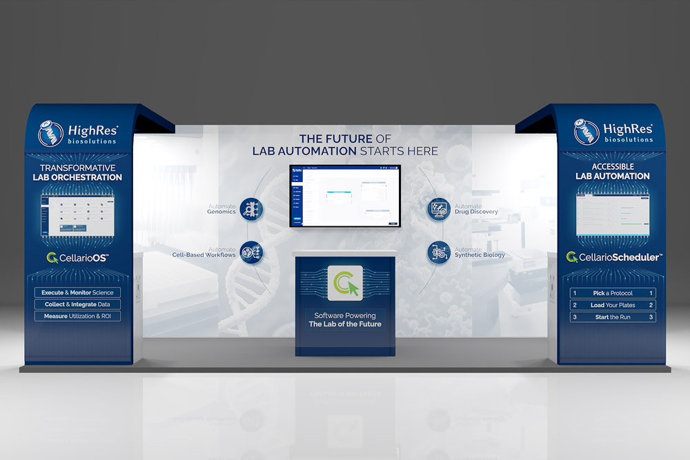
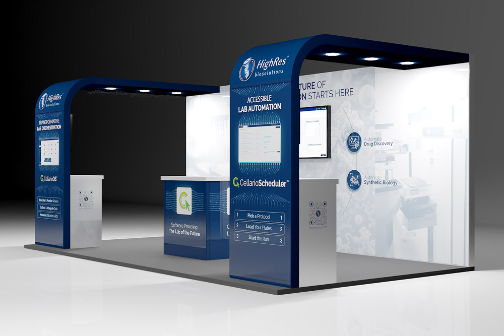
Future Labs 2025
Each booth needed to communicate the company's capabilities quickly to people walking by while providing enough depth for those who stopped to engage.
Large format graphics, signage, and display materials all followed the brand system. The booth designs balanced visual impact with informational clarity, using the isometric illustration style and color palette established in other materials.
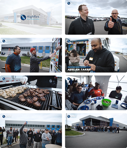
11.02. Event Photography and Video
The video was created to capture the atmosphere and emotions of HighRes Biosolutions' annual BBQ party. Filming focused on candid moments, people waiting in line, and B-roll shots to highlight the event's setting and mood. These visuals were paired with upbeat music and edited to match the flow of the video, creating a seamless narrative.
Postproduction:
- Logo Animation:
The video opens and closes with a simple logo animation to frame the content. - Color Grading:
The grading enhances contrast, highlighting textures of the environment. A subtle cool blue tint adds a clean look while keeping the tone natural. Shadows and highlights bring out details such as grill marks and smoke. - Purpose of Grading:
This style suits internal events, creating a vibrant atmosphere that reflects the celebratory mood. Cooler tones add energy and contrast with the warmer tones often used in marketing videos for external audiences. - Frame Rate:
The video was shot at 59.94 fps and conformed to 23.976 fps in post. 23.976 fps is the traditional frame rate for cinema. Unlike 30 or 60 fps, often used for smoother content like social media or sports, 24 fps creates a cinematic motion blur that feels familiar and nostalgic to viewers, enhancing the video's storytelling and emotional impact.
12. Outcome
Over five years, I built a brand system that touched every surface where HighRes Biosolutions appeared: software interfaces, marketing materials, trade show booths, internal documents, and corporate collateral.
The system was designed to scale. New materials could be created by following established patterns rather than starting from scratch. Consistency was maintained not through constant oversight but through clear documentation and accessible tools.
The questionnaire I ran at the beginning captured what employees valued about the company. The brand system I built preserved those qualities while addressing the gaps they had identified. The result was an identity that people at HighRes could stand behind because it accurately represented who they were.