
Crafting a Digital Brand Experience
Aligning Software Design with Brand Identity, Voice, and Hardware Inspiration
The design process began with an internal brand questionnaire and individual interviews to identify and define HighRes Biosolutions’ brand voice and personality. I then analyzed their hardware products, focusing on visual and functional elements that reflect the company’s role in lab automation.
Using these insights, I developed a design language for HighRes Biosolutions that aligns with their identity and resonates with employees. This design language was applied to create the UI for their software platforms, starting with CellarioOS, to establish a clear connection between their brand, hardware, and software.
Developing the Design Language
Step 01
Understanding the Brand
Step 02
Analyzing Hardware & Product Design
Step 03
Defining the Design Language
Step 04
The UI Design
Step 01: Understanding the Brand
Summary of Responses: What is HighRes Biosolutions’ voice(s)?

The Brand Voice
To create a design language that authentically represents HighRes Biosolutions, I began by conducting an internal brand questionnaire and individual interviews. These efforts provided insights into the company’s culture, communication style, and how employees perceive its personality and role in the industry.
This research, combined with an analysis of HighRes’ values and goals, formed the foundation for a brand voice that reflects both internal perspectives and external expectations. The resulting voice emphasizes professionalism, technical expertise, and approachability, aligning with the company’s client-focused mission and innovative outlook.
Summary of Responses: What is the personality of HighRes Biosolutions?

The Brand Personality
The brand personality of HighRes Biosolutions is defined by professionalism, innovation, and approachability. It combines clean and modern visuals that emphasize clarity and functionality, avoiding unnecessary embellishments. Structured layouts establish a professional tone, while softer accents and relatable imagery introduce warmth and accessibility.
This approach creates a visual identity that aligns seamlessly with the brand voice, reflecting HighRes Biosolutions’ mission and values. It resonates with both internal teams and external audiences, fostering trust and reinforcing the company’s leadership in lab automation.
Step 02: Analyzing Hardware & Product Design
Understanding the Physical Foundation for a Unified Design Language
To create software that aligns with HighRes Biosolutions’ brand and corporate identity, the design process began by analyzing the company’s hardware, particularly the Prime. The goal was to reflect key design elements of the hardware in the software, maintaining visual and functional alignment between physical and digital products. This strengthens the connection between the company’s offerings, creating a unified user experience that resonates with both the brand and its users.

Design Language of the HighRes Biosolutions Prime
Structure and Form
- Compact and modular: Designed for efficiency and adaptability in lab environments.
- Transparent panels: Revealing internal mechanisms to emphasize technical sophistication and innovation.
Color
- Deep blue and white: Reinforcing the corporate identity while conveying professionalism.
- Metallic and black accents: Adding contrast and precision to emphasize functionality.
Design Philosophy
- Purpose-driven and streamlined: Focusing on functionality and advanced technology without unnecessary embellishments.
- Balanced approach: Combining technical expertise with accessibility to appeal to a diverse range of users.
Step 03: Defining the Design Language
Bridging Brand Identity and Digital Experience
The design language for HighRes Biosolutions was developed by integrating insights gathered in Step 01 (Brand Voice and Personality) and Step 02 (Hardware and Product Design).
This approach maintains alignment between the digital experience and the company’s core values, brand identity, and physical product design.
Brand Alignment
The design language embodies the professionalism, innovation, and approachability that define HighRes Biosolutions. Every visual element, from typography to color usage, is rooted in the brand voice and personality, ensuring consistency across digital and physical touchpoints.
Hardware-Inspired Design
Drawing inspiration from the company’s hardware, particularly the Prime, the design incorporates modular layouts, clean lines, and purposeful transparency. These elements mirror the functionality, adaptability, and sleek aesthetics of HighRes’ physical products, strengthening the connection between hardware and software.
Color Palette
The Primary Blue Palette (#0B3158) forms the core, complemented by lighter shades for backgrounds and accents. Supporting colors from the extended palette add vibrancy and contrast, creating a dynamic visual experience while maintaining professionalism and reinforcing the brand’s identity.
Typography & Visual Hierarchy
Clean, modern typography underscores technical precision and enhances readability across devices. A well-structured visual hierarchy directs users through content effortlessly, with bold titles and organized layouts that reflect the brand’s service-oriented approach.
Consistency Across Mediums
By integrating shared visual elements, the design language bridges the physical and digital experiences. This consistent application builds trust and familiarity, enabling users to connect with the brand across all interactions.
Functionality-Driven Aesthetics
Usability and clarity guide the UI design.
Every element, from buttons to icons, prioritizes simplicity and functionality, creating an interface that is intuitive for new users while meeting the needs of advanced workflows.
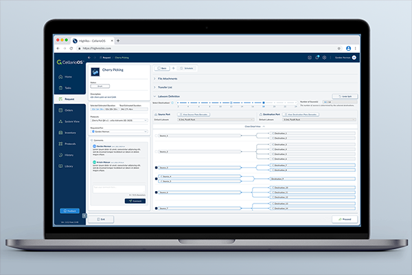
Step 04: The UI Design
Establishing Brand Recognition Through UI Design
The UI design for HighRes Biosolutions was crafted to create an immediate and unmistakable association with the company. By integrating the established design language, the software reflects the brand’s identity in every detail. This approach allows long-time clients and new users alike to recognize the software as distinctly belonging to HighRes Biosolutions, reinforcing familiarity and trust.


Hardware-Inspired Layout
The curved blue menu bar, extending from the left side to the top of the interface, draws inspiration from the flowing contours of the Prime hardware. This element creates a direct visual connection between the software and hardware, aligning the digital experience with the physical design of HighRes Biosolutions’ products.
Open Spaces in the UI
The Prime’s modular and spacious design informed the structure of the UI. When a menu item is selected, the interface reveals a clear and open content area. This mirrors the hardware’s emphasis on clean and functional spaces, improving usability and maintaining clarity for the user.

Subtle Visual Effects
In the Prime hardware, white elements paired with blue accents and shadows create a subtle optical illusion, where the white surfaces appear slightly tinted with blue. To reflect this effect in the UI, the background is designed with a slight blue tint instead of pure white. This subtle adjustment ties the software’s appearance back to the hardware’s aesthetic.
Connecting Brand Identity Across Platforms
By integrating design cues from the Prime, the UI reinforces a consistent visual identity across HighRes Biosolutions’ product ecosystem. These decisions create a unified experience that allows users to intuitively associate the software with the company’s hardware and its overall brand identity.
Unified UI Design Across Platforms
The design language developed for HighRes Biosolutions was applied consistently across all software platforms to maintain a unified and recognizable identity. By integrating the brand voice, personality, and visual elements established earlier, each platform reflects the company’s identity while meeting the specific functional needs of its users.
This approach connects HighRes Biosolutions’ software with its broader brand, making every interaction—regardless of the platform—feel like part of the same unified ecosystem. The consistent application of typography, color palette, and layout principles provides a seamless experience, reinforcing trust and familiarity for users across all platforms.


The Design System
The consistent application of the design language across all platforms and materials was made possible through the development of a structured design system. This system serves as a centralized framework, streamlining design processes and maintaining alignment with HighRes Biosolutions’ brand identity.
Below is a small snippet from the design system, offering a glimpse into its structure and elements. The full system includes a much broader range of resources and guidelines, designed to accommodate various design needs.

Extending the Design Language Across All Materials
The design language developed for HighRes Biosolutions extends beyond digital platforms, applying the same principles to all branded materials. This approach maintains the company’s identity across every touchpoint, from stationery to business cards and other physical assets.
By applying the established visual elements—such as the Primary Blue Palette, typography, and structured layouts—these materials represent the brand consistently. Whether in print or digital form, the design reflects the professionalism, innovation, and approachability that define HighRes Biosolutions.
This integration demonstrates how the design language supports not only user interfaces but also the company’s broader communication and presence across all mediums.
Stationary

PowerPoint Presentation

Isometric Graphics


Integrating Design & Strategy
This work represents a complete effort to redefine HighRes Biosolutions’ visual identity, spanning brand strategy, design language development, UI design, and beyond. Every aspect of the process—from conducting research and defining the brand voice to crafting the design system and applying it across all platforms—was undertaken independently.
Achieving this required a multidisciplinary approach, combining skills in branding, UI/UX design, communication, and strategy. The result is a unified, brand-driven approach to design that aligns HighRes Biosolutions’ physical and digital products while reflecting its values and mission. This work highlights a deep understanding of design principles and the ability to integrate branding, communication, and functionality into a consistent system.
<< Previous Project
User Experience

Augmented Reality TV
Next Project >>
User Experience

Neumorphic Music App