When Figma and the Code Disagree,
Which One Is Right?
Neither of them is right for everything, because each kind of decision has its own owner, such as the token file for a color and the code for the behavior of a button.
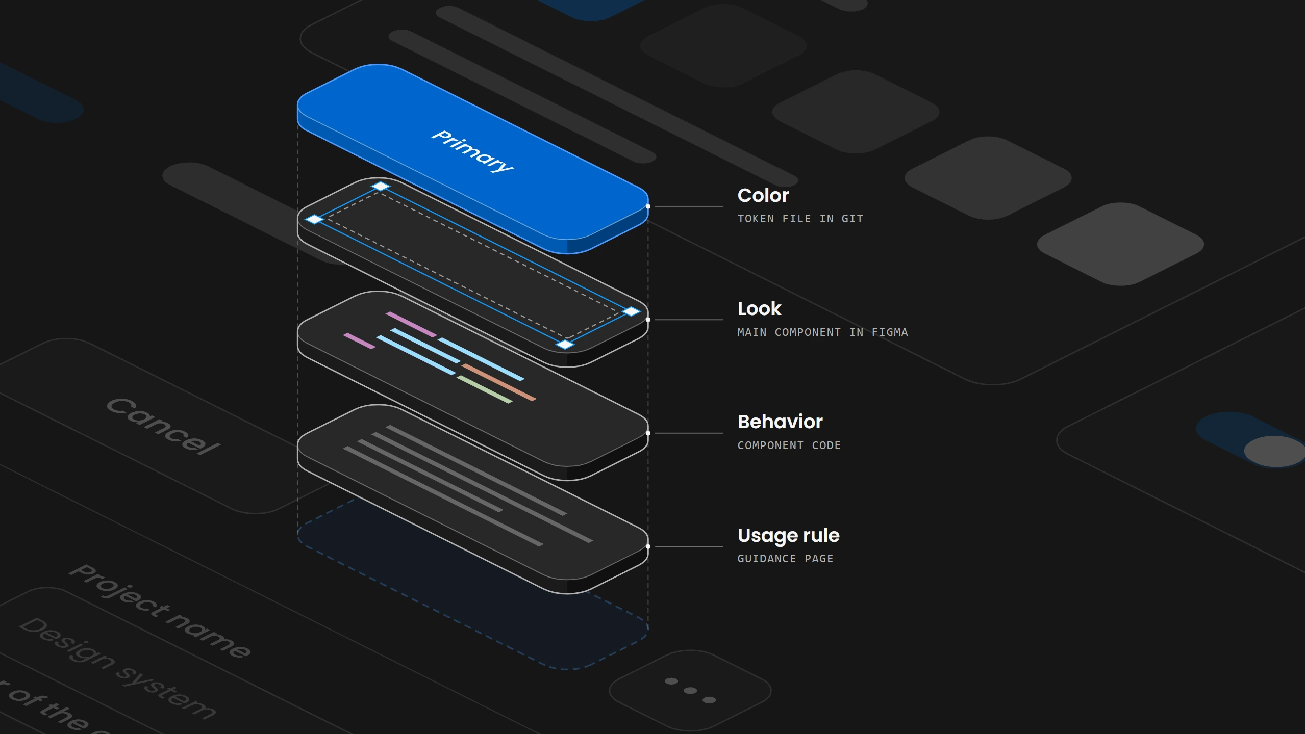
Overview
A design system holds several kinds of decisions, and each kind has its own owner. The approved value of a color belongs in the token file in the repository, the behavior of a button belongs in its specification and its code, and the rule for when to use which button belongs in the written guidance. Figma and the code both show these decisions, but neither of them owns all of them, so the question of which one is right has a different answer for each decision.
The tools that connect Figma and code copy values from one to the other, but none of them decides who owns a decision. Figma can import and export token files, Style Dictionary can turn a token file into CSS, and Code Connect can show the matching code beside a Figma component, while the team still has to choose the owner of each decision and the direction in which changes travel.
When Figma and the code disagree, the fix starts by naming the decision that differs and the file that owns it. The change is made in that file and then copied from there to every other place, and it counts as done only once the product and the Figma files that use it have received it.
01. Introduction
A main action button can end up with three blues. The Figma library holds one value, the CSS variable in the code holds a slightly different one, and the screen the customer sees shows a third, because a developer once overrode the color for a single page. Each change was made in whichever file the person had open, and nothing carried it to the other two.
Real teams describe the same pattern. The studio EDL found it on a client product when customers piloting a redesign complained that things looked wrong, and an audit showed that button variants, icon stroke widths, spacing and the names of component properties had drifted, while a page header had become sticky in code without ever being designed that way. The WordPress design team audited its components in 2024 and marked the progress bar and the snackbar as out of sync between Figma and code, and it listed coded components that had no Figma counterpart at all.
Companies hire for this problem. A Creative Circle posting from September 2026 asks a designer to maintain alignment between Figma components and coded components in Storybook, and a DNV posting from October 2026 asks for Figma libraries and variable collections that are kept in sync with the coded components.
When designers discuss it, the question is usually where the source of truth should live. In 2026 threads on r/DesignSystems, the places people discussed for it included Figma, Tokens Studio, the code, Storybook and Markdown files. But the color of the button, its behavior and the rule for when to use it are separate decisions, and they do not have to live in the same place.
02. Why one source of truth falls short
Calling one tool the source of truth for everything hides the fact that the decisions in a design system have different owners. The value of a color is decided in the token file, the behavior of a component is decided in its specification and its code, and the choice between two components is decided in the usage guidance.
Each of these owners has something that is easily mistaken for it. A hex value copied from a screenshot does not decide the color, because the token file can change it the next day. A Figma variant labeled Disabled does not decide how a disabled button behaves, because a boolean property in Figma only shows or hides layers, while the code decides whether the button can still be clicked. A component that happens to be called Primary does not decide whether a destructive action should use it, because that rule lives in the guidance.
Color value
Component behavior
Which component to use
| Decision | Owner | Mistaken for the owner |
|---|---|---|
| Color value | Token file | A hex value from a screenshot |
| Component behavior | Specification and code | A Figma variant called Disabled |
| Which component to use | Usage guidance | A component named Primary |
Teams that have settled this name the owner per decision. WordPress states that its Gutenberg repository on GitHub remains the source of truth for its components package, and its Figma library is built to match the codebase as closely as possible. GitHub's Primer team changes its color tokens in the code and runs an automated contrast check on every pull request that changes a token, which made the code the place where those color values are edited and tested.
The file that changed last is not automatically the right one. A timestamp shows when something changed but not whether the change was approved, and an edit made last week in Figma can still be an unapproved change to a value that the token file has held for a year.
03. Where each decision lives
Each kind of decision has one file where it is edited and several places that are generated from it or follow it. Token values are edited in versioned token files in the repository and become CSS variables, the color files of the iOS and Android apps, and Figma variables. Component behavior is edited in the component source and its specification and becomes the built package and the running examples in Storybook. The main components in the Figma library become the instances in every design file that uses the library, and the usage guidance is edited in one documentation page that links to the matching code and Figma components.
The difference between an edited source and a generated copy decides where a change has to go. If someone edits the generated CSS file by hand to fix the blue, the next build overwrites the edit, because the build writes that file again from the token file. The same happens to a value changed in a derived Figma variable, as soon as the next import or sync writes the value from the token file back into Figma.
Figma can either follow the code or lead it. EDL rebuilt its client's Figma library from the implemented components and mirrored the CSS token names in Figma variables, so Figma follows the code. Databox reads the variables its designers define in Figma and generates the matching code, so the code follows Figma for color, spacing and typography. Both arrangements work, as long as every decision has one place where it is accepted.
If someone edits the generated CSS file by hand to fix the blue, the next build overwrites the edit, because the build writes that file again from the token file.
04. Following one token from source to screen
The color of the main button starts as a token in a JSON file in Git. A common format for this file is the one published by the Design Tokens Community Group, whose version 2025.10 from October 2025 is its first stable release. In that format the brand blue is a color token with a color space, its components and a hex fallback, and the button background is a second token whose value points to the first one with the path {color.blue}.
{
  "color": {
    "blue": {
      "$type": "color",
      "$value": {
        "colorSpace": "srgb",
        "components": [0, 0.4, 0.8],
        "hex": "#0066cc"
      }
    }
  },
  "button": {
    "primary": {
      "background": {
        "$type": "color",
        "$value": "{color.blue}"
      }
    }
  }
}
A build tool turns this file into CSS. Style Dictionary, now in version 5, reads the token files, applies a group of transforms that turn the names into kebab case and the colors into CSS values, and writes them with its css/variables format as custom properties on :root. With the option outputReferences turned on, the button token keeps its link to the brand blue as var(--color-blue), so a change to the blue reaches the button without a second edit. Style Dictionary has read this format since version 4, but its documentation says that version 2025.10 is not fully supported yet, so the team checks the generated file after every change to the format.
:root {
  --color-blue: #0066cc;
  --button-primary-background: var(--color-blue);
}
The button component uses var(--button-primary-background) for its background, and the product picks up the new value once the generated file is built and shipped with the code.
The same token reaches Figma on a second path. Figma imports this JSON format into a variable collection, where each imported file becomes one mode such as light or dark, and the alias becomes a variable alias. Teams with a Full seat on an Enterprise plan can also write variables through Figma's REST API, and a plugin can do the same on other plans.
The new value then sits in the library file until it is published, and each design file that uses the library sees an update that someone has to accept before the button there turns to the new blue.
05. One component in design and code
A component has properties in Figma and props in code. In Figma a variant switches between versions such as the style of the button and a boolean shows or hides a layer, while the coded button has props such as emphasis, intent, disabled and pending.
Each Figma property has to be connected to the prop that means the same thing, whether or not the names match. The Figma choice Emphasis Primary maps to emphasis="primary", and the choice Intent Destructive maps to intent="destructive", which marks the consequence of the action and is more than a red color. Pending in Figma only shows how the waiting button looks, while in code the application decides when the request starts and ends, and Disabled in Figma only changes the look, while in code it blocks the action. The Figma library should not offer a combination that the code cannot build, and the code should not quietly change what a design option means, for example by making every Primary button full width when Figma shows it at the width of its label.
Emphasis Primary
emphasis="primary"Intent Destructive
intent="destructive"Pending
pendingDisabled
disabled| Figma property | Code prop | In Figma | In code |
|---|---|---|---|
| Emphasis Primary | emphasis="primary" | Shows the primary style | Renders the primary style |
| Intent Destructive | intent="destructive" | Shows the button in red | Marks the consequence of the action |
| Pending | pending | Shows the waiting state | Decides when the request starts and ends |
| Disabled | disabled | Shows the disabled state | Blocks the action |
Code Connect is Figma's way of writing this mapping down. A developer connects the coded button to the Figma button and maps each Figma property to a prop, and the result appears as a code snippet in Dev Mode and as context for AI tools through Figma's MCP server. It needs an Organization or Enterprise plan and a Full or Dev seat, and the property mapping only works in the version set up from the code repository, since the setup inside Figma does not support property mapping yet. Figma stopped maintaining the older framework parsers in August 2026, and new mappings are written as template files.
Code Connect shows the mapping, and keeping it correct stays with the team. Figma's documentation tells teams to review the output with designers and developers and to update the mappings when the component's code interface changes, because a stale mapping can still point to a prop that no longer exists.
06. Which way changes flow
A change can flow in one direction or in a controlled way in both. In a one-way setup, the owner of a decision updates every other copy, and an edit made in a copy becomes a proposal that goes back to the owner for review. In a controlled two-way setup, both Figma and the code can start a change, but each change still has to be accepted in the one place that owns that decision, after checking that neither side changed in the meantime.
For the button color, a one-way setup means the token file in Git owns the blue. A designer who tries a new blue in a Figma variable is proposing a change, and the proposal goes into a branch, the difference is reviewed and the token file is updated before the new value is generated into CSS and Figma. Two tools that can both write values do not make a two-way setup safe, because writing access says nothing about which side is allowed to decide.
Figma adds its own steps between an edit and a change that others can see. An edit to a variable stays in the library file until the library is published, and other files only change once someone accepts the update. A new value from Git reaches Figma through an import, a plugin that someone starts, or a script that uses Figma's REST API for variables, which needs an Enterprise plan. A change counts as delivered once it is edited at the owner, published, accepted in the files that use it and checked in the product.
Two tools that can both write values do not make a two-way setup safe, because writing access says nothing about which side is allowed to decide.
07. When design and code disagree
A mismatch has to be classified before it can be fixed, because each kind has a different repair. An accidental value drift, such as the third blue on one page, is fixed by correcting the source or removing the override. A design option the code cannot support either gets built or is marked as unavailable in Figma. Code that behaves differently from the approved specification is fixed in the code, or the specification is changed on purpose with evidence. A difference that is intended, such as a native control on iOS, is recorded together with the meaning both versions share. A rule that only one product follows stays in that product, and a test result from before a change is checked again after it.
Accidental drift, such as the third blue
A Figma option the code cannot build
Code that breaks the approved specification
An intended difference, such as a native iOS control
A product rule that differs
Evidence that is out of date
| Mismatch | Repair |
|---|---|
| Accidental drift, such as the third blue | Correct the source or remove the override |
| A Figma option the code cannot build | Build it in code, or mark it unavailable in Figma |
| Code that breaks the approved specification | Fix the code, or change the specification with evidence |
| An intended difference, such as a native iOS control | Record the meaning both versions share |
| A product rule that differs | Keep it in that product |
| Evidence that is out of date | Check it again |
The fix then follows seven steps, from naming the files involved to recording what changed.
- Name the files and versions involved.
- State the exact difference.
- Find the decision that controls it and its status.
- Decide which file is wrong.
- Make the smallest correction in the file that owns the decision.
- Check the products and files that use it.
- Record what changed.
A text field shows why the classification matters. The Figma component shows an error state with a red border, while the coded field shows the error and also its focus ring when a person tabs into it.
Removing the focus ring from the code would make the two match, but the approved interaction specification requires visible focus, so the correct repair is to add the error-with-focus state to the Figma component.
08. Keeping them in step
Drift is found by comparing what each copy should hold with what it actually holds. For tokens, that means the values, types, names and modes in the generated CSS and in the Figma variables against the token file, and for components, the properties in Figma against the props in the code. Every difference is sorted as intended, as a design option the code cannot build, or as a mistake, and it gets a person who is responsible for fixing it.
Each decision also needs a person who is responsible for it. EDL named the people responsible for token maintenance, component development, quality checks and adoption when it repaired its client's system.
Part of this runs on its own. Generated files are never edited by hand and are rebuilt from the source on every change, and a check in the code repository runs on every pull request that changes a token, the way GitHub's Primer team checks color contrast. The rest belongs to the team's routine. The Code Connect mappings are updated in the same change that alters a component's props, and once a release is out, someone follows one real token and one real component configuration from the source through the build and the Figma library into the product.
- Compare the values, types, names and modes in the generated CSS and in the Figma variables against the token file.
- Compare the properties in Figma against the props in the code.
- Sort every difference as intended, as a design option the code cannot build, or as a mistake.
- Name a person who is responsible for each decision and for fixing each difference.
- Rebuild generated files from the source on every change, and never edit them by hand.
- Run a check in the code repository on every pull request that changes a token.
- Update the Code Connect mappings in the same change that alters a component's props.
- After a release, follow one real token and one real component configuration from the source into the product.
09. Where to start
A team starts with the main button and its color. It writes down which file owns the color value, which owns the button's behavior and which owns the rule for when to use it, then follows the color from the token file through the generated CSS and the Figma variable to the screen and lists every place where the value differs. Each difference is fixed in the file that owns it and copied from there to the other places. Once that one button stays in step through a full release, the same steps extend to the next component, and a second direction is added only when designers and developers both need to start changes.