If Every Component
Is Accessible,
Why Does the
Screen Fail?
Each component promises only what it controls, so the screen decides the rest, such as where focus goes after a cancelled order leaves the list and whether a fixed bar hides the focused button.
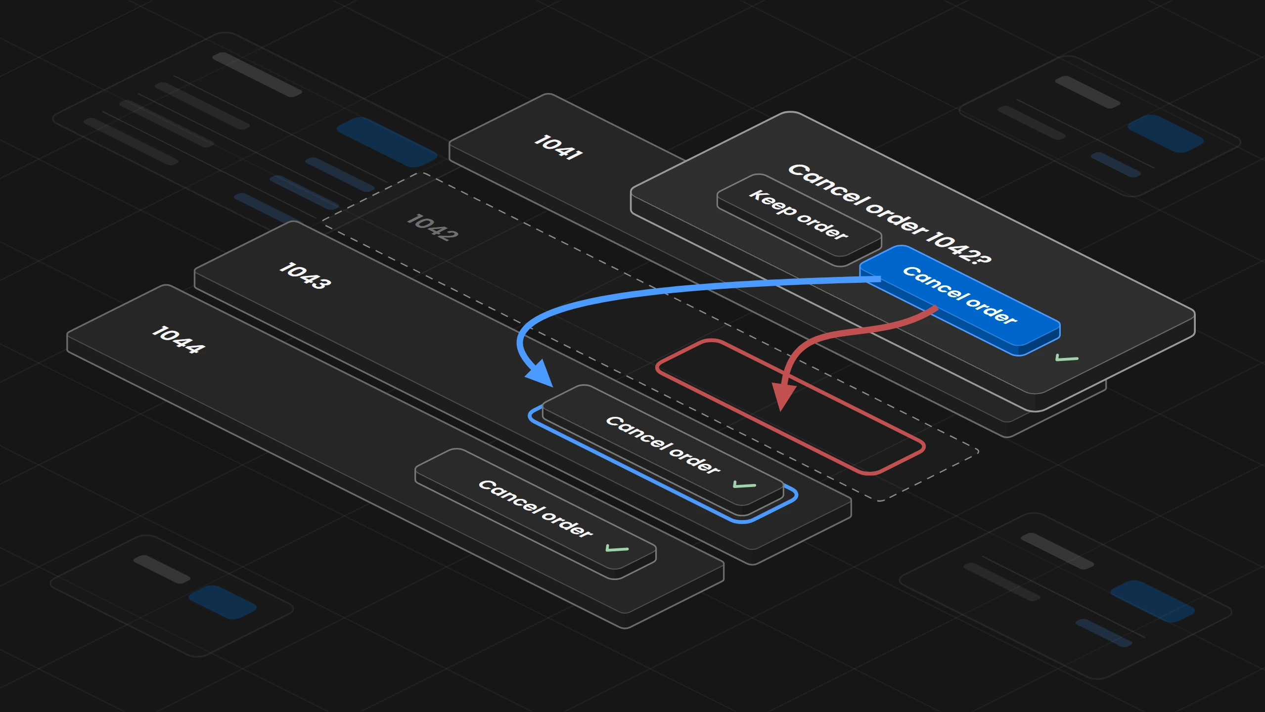
Overview
A screen built only from accessible components can still stop a person who uses a keyboard or a screen reader. Each component can promise only what it controls, and the screen has to decide the rest, such as where focus goes after an action removes the button that had it. A design system team writes down two lists for every component, one with what the component guarantees itself and one with what the screen that uses it has to supply. It checks a complete task with the keyboard and with a screen reader, because an automated scan reads the page as it stands and does not follow the task. It uses the two lists when it reviews the design of a new screen, when it reviews a proposed component and when it audits its own library. Start with the components that change what is on the screen, such as a dialog or anything that removes a row.
01. Introduction
The orders app shows a list of open orders, and each row has a button called Cancel order 1041, Cancel order 1042 and so on. The button opens a dialog that asks whether to cancel order 1042, with the buttons Keep order and Cancel order. A bar fixed to the bottom of the list shows the total of the open orders. The button and the dialog come from the shared design system, and each passed its own accessibility checks.
Focus is the place on the screen where the next key press goes, and a keyboard user moves it from one control, such as a button or a text field, to the next with the Tab key. A screen reader is the software that speaks what is on the screen for people who cannot see it. The button can be reached with the Tab key, shows a ring around itself when it has focus, and has a name that the screen reader reads out. The dialog handles focus in three steps. It moves focus to its Keep order button when it opens, because that choice changes nothing, keeps focus inside while it is open, and gives it back to the button that opened it when it closes.
A keyboard user opens the dialog for order 1042, presses Tab to reach Cancel order and presses Enter. The order leaves the list, and the button that opened the dialog leaves with it, so the dialog has nothing to give focus back to. Focus falls back to the page itself, nothing tells the screen reader user that the order was cancelled, and the user has to find the list again to reach order 1043. Both components did what they promised.
The failure is a decision nobody made, which is where focus goes after an order disappears.
02. Two Lists for Every Component
A design system prevents this by writing down two lists for every component. The first list says what the component guarantees itself, such as the dialog's rule that focus goes back to the button that opened it. The second list says what the screen that uses the component has to supply, such as where focus goes when that button no longer exists. Together the two lists are called an accessibility contract. With the second list in hand, the orders app sends focus to the Cancel order button of order 1043 and has the screen reader announce that order 1042 was cancelled.
The second list holds more than focus. The button can carry any name, but the orders app writes it, and ten buttons all called Cancel order do not tell a screen reader user which order each one belongs to, while Cancel order 1042 does. The dialog has a place for an error message, but the orders app writes the message, such as that order 1042 has already shipped and can no longer be cancelled. The button's focus ring is visible on its own, but the bar with the order total can hide the focused button in the last row completely, which WCAG, the W3C accessibility guidelines, counts as a failure since version 2.2.
03. What Each Check Can Find
A team has four ways to check a screen, and on the failing orders screen each one finds something different. An automated scan, such as axe or Lighthouse, reads the page as it stands and finds problems such as a button without a name or text with too little contrast. The orders page has none of these before or after the order disappears, so the scan finds nothing. Neither tool has a rule that closes a dialog or removes a row and then checks where focus lands, and Lighthouse lists that kind of focus check as a manual one that does not count toward its score. A review of names and messages reads every label and message in its place and finds nothing either, because every button already says which order it cancels. A keyboard walk goes through the whole task with the Tab and Enter keys and finds that focus falls back to the page after the cancel. A screen reader walk goes through the same task once more and finds that nothing announces the cancel. Both walks catch the one failure of the screen.
A scan without findings means that the rules it ran found nothing on that page. So every check is written down in a test record with what it covered, which is its states, its content and its method. For the keyboard walk on the orders screen, the states are a list with four orders, the cancel of the last row and the cancel of the only order left. The content is real order numbers and the message for an order that has already shipped. The method is the Tab and Enter keys in one named browser, and for the screen reader walk the named screen reader with that browser. The U.S. Web Design System publishes such records for its components, where each test of its modal names the expected behavior, the WCAG criterion and the result. Its test that headings and labels are descriptive is marked conditional, because "This can only be tested in your implementation of the component."
The Design Engine's audit reads a product's code files and reports text with less contrast than 4.5 to 1, or 3 to 1 for large text, a focus outline that is switched off with no other style for keyboard focus, and a button that holds only an icon and no name. Its report works the way a clean scan should be read. It lists findings and never a pass, and its conformance field always reads NOT_ASSESSED.
A scan without findings means that the rules it ran found nothing on that page.
04. Reviewing a Screen Design Before It Is Built
The lost focus can be caught in the design of the cancel flow, before anyone writes code. When the orders team shows the design, the system team goes through each action with four questions and writes the answers into the design.
- Where does focus go after the cancel?
To the Cancel order button of the next row, which is order 1043. - What is each button called?
Cancel order with the order number, such as Cancel order 1042. - What does the error say?
That order 1042 has already shipped and can no longer be cancelled, shown in the dialog. - What could cover a focused control?
The bar with the order total, so the list leaves space below the last row and the bar never hides its button.
05. Reviewing a Proposed Component
When a team proposes a new component, the system team reviews it before it joins the library. The review asks for both lists and for the test record from section 03. A proposed dialog that always gives focus back to the button that opened it, with no way for the screen to name another place, goes back to its team, because the orders app could not have sent focus to order 1043 with it. Public component libraries offer this way out, such as an event in Radix that lets the screen stop the return and move focus itself, and a setting in MUI that switches the return off. The component owner then decides whether the dialog joins the library, as Who Owns the Design System? describes.
Each requirement of the component gets a requirement record that connects it to the two lists and to the test, so a reviewer sees what the component meets, what the screen must supply and how it was tested. Public design systems publish parts of such a record, for example the WCAG criterion and the result of each test, and what the product must supply. The record below also names an owner and the change that reopens it.
Requirement:   WCAG 2.2, 2.4.3 Focus Order, Level A
Applies to:    Dialog, when its action removes the button that opened it
Dialog:        returns focus to the opening button, or leaves focus to the screen
               when returnFocus is false
Screen:        moves focus to the same button in the next row, the row before it,
               or the list heading
Tested:        keyboard walk and screen reader walk with four orders, the last row
               and an empty list
Known limits:  none recorded
Owner:         Dialog maintainers
Reopen when:   the dialog's focus handling changes
While the proposed component is written with an AI agent, the Design Engine's edit hook runs its audit on every file the agent edits, so the proposal reaches the review with those rules already checked.
06. Auditing the Library for Gaps
An audit of the library goes through every component page and looks for five kinds of gaps.
- A component with no second list, such as a dialog page that says the dialog is accessible and never says what the screen supplies.
- A second list that misses a case, such as the dialog's list without the button that disappears.
- The word accessible with no test record behind it, such as a dialog page that calls the dialog accessible and names no state, content or method that was tested.
- A known limitation that product teams cannot find, such as a screen reader problem that is noted in an issue tracker and missing from the component page.
- A test record older than the last change to the component, such as a dialog that was tested before its focus handling changed.
GOV.UK lists the open accessibility questions of a component on its page, and IBM Carbon shows for each component which kinds of testing are done.
The Design Engine's audit can run over the whole library. It records the commit and a fingerprint of every file it read, so the same audit can be run again on the same files, and a finding whose rule has a written explanation names the topic that holds it.
07. Whose Failure It Is
When a screen fails, the team first finds out whose failure it is. It runs the dialog alone in the design system's own example, then with the orders app's setup. If the dialog fails alone, the fix belongs in the library. If it passes alone and fails only in the orders app, the fix belongs to the orders app. If the dialog cannot do what the task needs, the library has a gap. In the example the dialog kept its promise, so the fix belongs to the orders app.
The invoices app also removes rows from a list, so the system team turns the fix into a shared pattern for removing an item from a list, and both apps follow it. The pattern says where focus goes in every case. Focus moves to the same button in the next row. When the removed row was the last one, it moves to the same button in the row before. When no row is left, it moves to the list heading, which then says that the list is empty. A short message announces what was removed, such as that order 1042 was cancelled. Salesforce's Lightning Design System covers the same three cases in its focus guidelines, with the next row, the row before when the last one is removed, and the list itself or a message that it is empty, and W3C's own example of a delete confirmed in a dialog puts focus on the next item.
function onCancelled(id: string) {
  flushSync(() => setOrders((orders) => orders.filter((order) => order.id !== id)));
  setStatus(`Order ${id} cancelled`); // text of <p role="status">, always on the page
}

function onDialogClosed(index: number) {
  const buttons = listRef.current!.querySelectorAll<HTMLButtonElement>('[data-cancel]');
  const next = buttons[index] ?? buttons[index - 1]; // same button, next row or row before
  if (next) next.focus();
  else headingRef.current!.focus(); // <h2 tabIndex={-1}> says "No open orders" when empty
}

<Dialog
  returnFocus={false}
  onConfirm={() => onCancelled(order.id)}
  onClosed={() => onDialogClosed(index)}
/>08. What a Team Can Claim
WCAG judges whole pages and complete processes. A page meets it only when everything on the page does, and a process only when every page in it does. So an accessible component library cannot make its products accessible by itself, and a component that passed its checks is evidence for that component, in the states and with the methods it was tested. The U.S. Web Design System writes on its accessibility page that "Building with accessible USWDS components does not guarantee an accessible service." A team says exactly what it checked, such as that the orders app's cancel flow passed a keyboard walk and a screen reader walk with four orders, the last row and an empty list. W3C's method for evaluating a website, WCAG-EM, takes every page of a process it samples, so an audit of the cancel flow covers the list, the dialog and the list after the cancel.
To start, write the second list for the components that change what is on the screen, such as dialogs and anything that removes a row, and walk one complete task with the keyboard and a screen reader. INAGAWA Design sets this up for a team's own design system.